Preview image. Unlock full-res
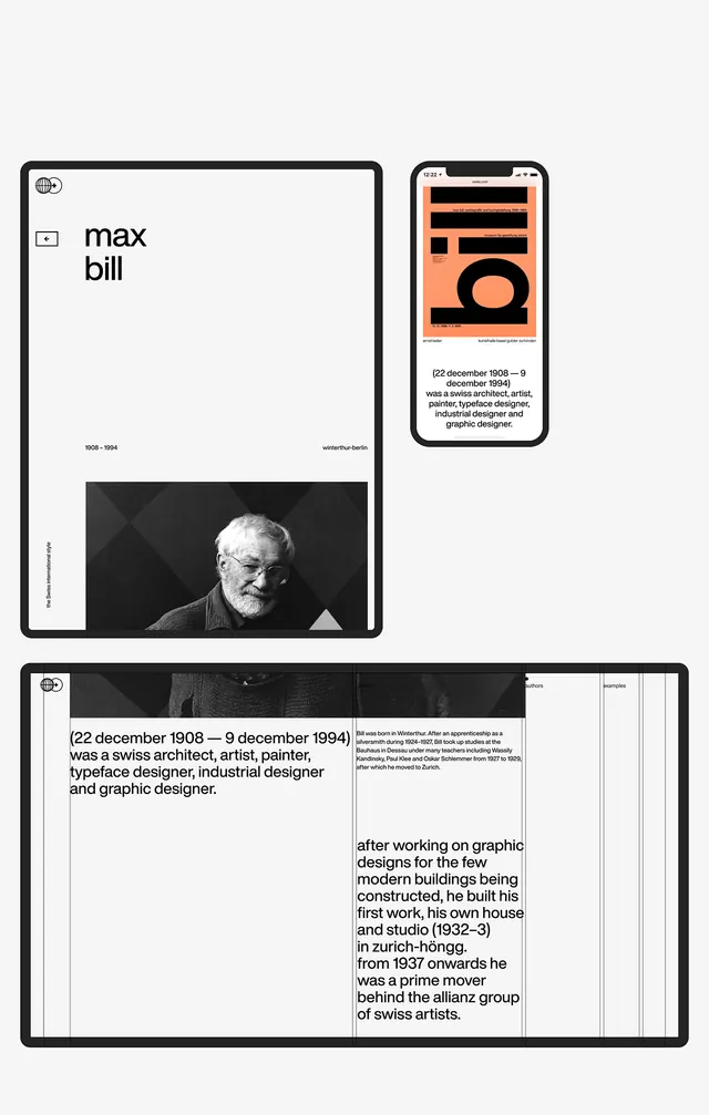
A modernist biographical design system for designer Max Bill, using stark black-and-white grids with burnt-orange accent elements and minimal sans-serif type across tablet and desktop mockups.
Summary
A modernist biographical layout system for Max Bill, using a black-and-white grid structure with small burnt-orange accent bars to organize dense historical and professional information, shown across tablet and desktop compositions.
Visual description
Three design compositions arranged vertically, each shown in clean black borders. Top left: a tablet mockup with a portfolio page showing "max bill" in small sans-serif caps, a checkbox, and a black-and-white photograph of a man (Max Bill) with a burnt-orange vertical accent bar on the left edge. Top right: another mobile screen mockup featuring the same orange accent treatment with dense body text. Bottom: a larger desktop composition showing a structured grid layout with dense biographical text broken into columns, a horizontal burnt-orange bar creating visual division, a monochromatic photograph, and additional reference text at the bottom. All typography is sans-serif, high-contrast black on white, with extreme visual economy.
Key takeaway
The disciplined use of a single accent color (burnt orange) as a linear element rather than a filling or background, creating visual rhythm without visual noise; the clear grid structure that organizes dense text into scannable blocks; and the balance between information density and whitespace, where restraint in color and decoration makes the type hierarchy more powerful.
Reuse notes
Perfect for academic profiles, historical or artist biographies, and portfolio systems where authority and precision matter more than visual decoration. The extreme monochromatic approach works well for historical subjects and serious professional contexts. Responsive across screen sizes because the grid is content-driven rather than image-driven. The accent orange can be substituted but works best as a single, warm contrast to cool neutrals. Works especially well with condensed or small-cap sans-serif typefaces.
More like this


Keep what you find
A free account saves references to boards and can send you a weekly email of picks based on what you save.
To see every result, go Pro.