Preview image. Unlock full-res
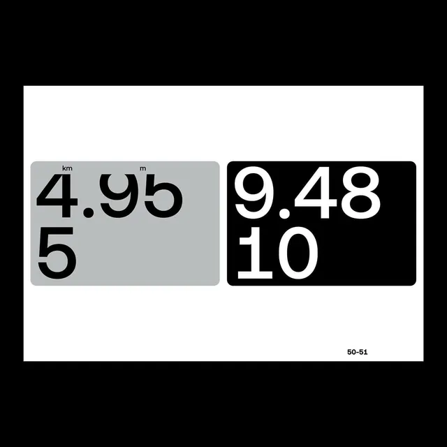
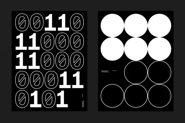
A two-card layout comparing numerical measurements in sans-serif typeface with one card in light gray and the other in black background.
Summary
A typographic comparison card displaying numerical values in a sans-serif typeface, with side-by-side contrast of light and dark backgrounds emphasizing readability and design precision.
Visual description
Two rounded rectangular cards sit side by side against a white background. Left card has light gray background with bold sans-serif numbers "4.95 km" and "5" in black text with a small unit label. Right card has black background with the same sans-serif weight in white text showing "9.48" and "10". Both use generous spacing and a modern, condensed geometric sans-serif. A page number "50-51" appears in small text bottom right.
Key takeaway
The effective use of extreme color contrast (black-white) to demonstrate typeface legibility and weight hierarchy. Parallel layout structure allows viewers to immediately compare how the same type performs across different contrast scenarios.
Reuse notes
Perfect for typeface promotion materials, font specimen sheets, or design system documentation. The comparison format works well for UX deliverables showing accessibility across light and dark modes, or for presenting technical specifications in design-forward presentations.
More like this

Keep what you find
A free account saves references to boards and can send you a weekly email of picks based on what you save.
To see every result, go Pro.