Preview image. Unlock full-res
A five-slide carousel exploring a new brand identity and website launch with minimal typography, nostalgia-tinged object photography, and playful motion moments.

Summary
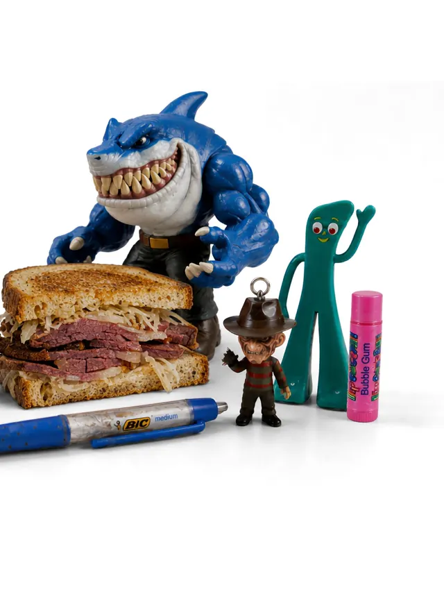
A five-slide carousel revealing Study Hall's new brand identity, cycling through a minimalist analog clock interface, nostalgic product photography (Gameboy, office supplies), and text-driven layouts that celebrate movement and momentum.
Visual description
Slide 1 (cover): A centered analog clock with hour and minute hands, tick marks, weather icon, temperature display (72°), and subtle inline labels below. Monochrome, clean, Swiss-style grid alignment. Slide 1 also appears to be a video frame given the accompanying motion file. Subsequent slides shift between stark monochrome backgrounds with nostalgic object photography (including vintage Gameboy and office supplies visible in accessibility captions), large sans-serif headlines ("We're built to move you"), and text-focused layouts celebrating the brand's mission around momentum and motion. Consistent light background, high contrast black type, minimal decoration.
Key takeaway
Minimalism paired with playful nostalgia creates warmth without clutter. The clock as a centerpiece is a clever metaphor for timing and momentum. Using retro objects as visual anchors lets modern typography take center stage. Text hierarchy and breathing room are as important as the photography.
Reuse notes
Excellent reference for design studio or motion-focused brand identities. Minimal, confident approach suits B2B and professional services. Pair with video loops of actual motion work to demonstrate capability. Nostalgia works well for companies celebrating their heritage or shift in direction. Monochrome palettes keep focus on form and hierarchy; add one accent color if you need a call-to-action pop.
From this post: Study Hall brand and motion design carousel
View post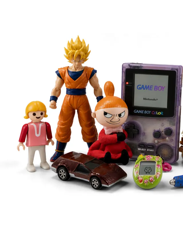
More like this



Keep what you find
A free account saves references to boards and can send you a weekly email of picks based on what you save.
To see every result, go Pro.