Preview image. Unlock full-res
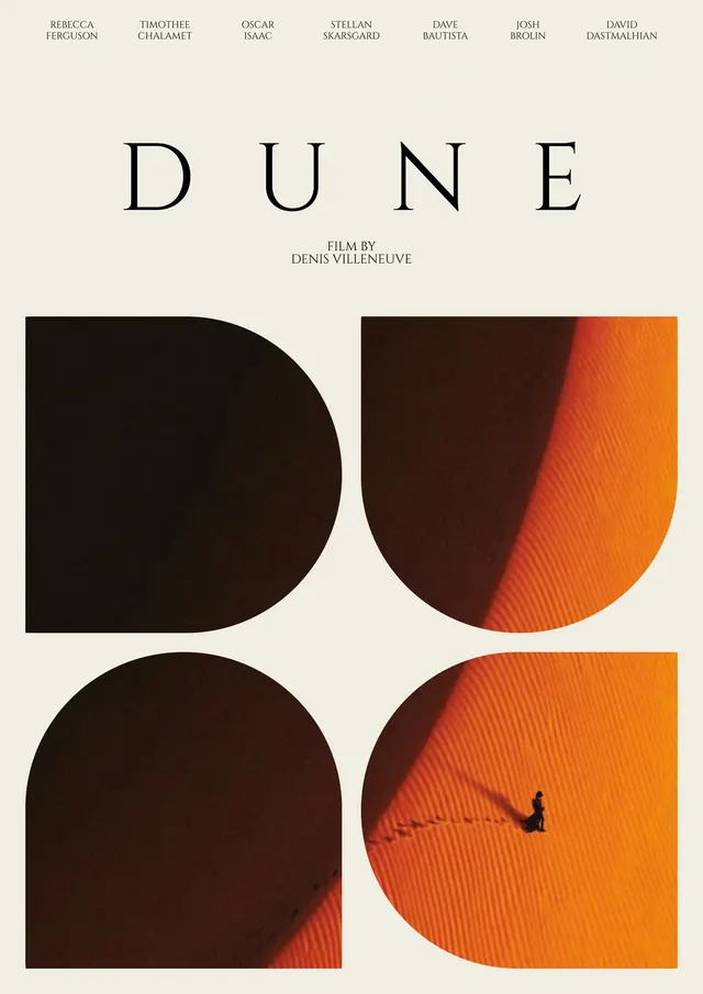
Editorial-style alternative film poster for Dune, pairing a serif title lockup with a four-panel arched grid of desert photography.
Summary
An editorial alternative poster for the film "Dune," combining a small cast-and-credit block, a wide-spaced serif title, and a four-panel grid of arch-shaped desert photography below.
Visual description
On a warm off-white background, a row of cast names runs across the top in small tracked-out serif caps, followed by the word "DUNE" set very large in a classic serif with generous letter spacing, and a smaller "FILM BY / DENIS VILLENEUVE" credit beneath it. The lower half of the poster is a 2x2 grid of images, each cropped into an arch shape so the four arches together spell out the negative-space impression of the title's block letters. The photographs show sun-lit sand dune ridges in deep orange and brown tones, with one panel containing a tiny silhouetted figure walking a winding path across the dune, casting a long shadow.
Key takeaway
Cropping photography into repeated arch shapes so the grid itself reads as abstract lettering is a clever way to fuse image and typography into one unified poster shape, while a plain serif title and slim credit line keep the tone restrained and editorial.
Reuse notes
Useful reference for film, book, or exhibition posters that want a literary, art-house feel rather than a typical blockbuster look. The arch-grid device works well whenever a set of related photographs needs to be unified under a single silhouette or wordmark. Needs photography with strong, warm directional light to read well inside the arch crops.
More like this

Keep what you find
A free account saves references to boards and can send you a weekly email of picks based on what you save.
To see every result, go Pro.