Preview image. Unlock full-res
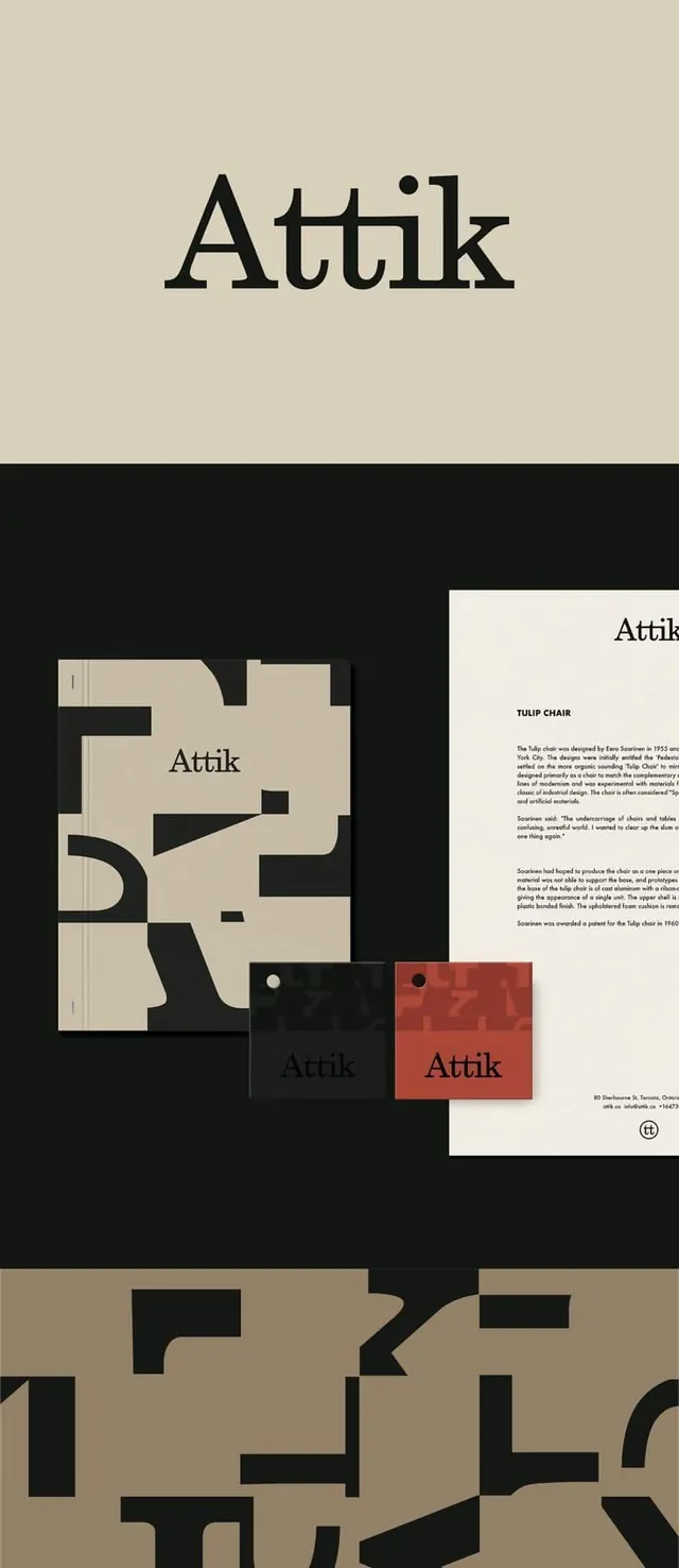
Brand identity for 'Attik' built on a serif wordmark and a graphic pattern of oversized cropped letterforms, applied across notebook, tags and a typeset letterhead in cream, black and terracotta.
Summary
An identity for "Attik" whose signature device is a busy pattern of oversized letterforms cropped at the bleed, paired with a calm transitional-serif wordmark and a warm cream, black and terracotta palette.
Visual description
A tall vertical layout in three stacked zones. At top, the "Attik" wordmark sits large and centered in a high-contrast serif on a cream field. The middle zone goes black and lays out the system in mockup: a notebook cover and two swing tags filled edge to edge with fragments of black letters scaled up far past legibility, beside a clean white letterhead with a small serif heading, justified body text and a circular "tt" monogram at the foot. The bottom zone repeats the cropped-letter pattern in black on a darker tan ground. The serif wordmark recurs at small size on every applied piece.
Key takeaway
Turn the brand's own letterforms into the pattern: blow type up until it reads as abstract shape, crop it at the edges, and tile it across covers and tags so every surface is clearly the same brand without a logo lockup. One warm terracotta accent against cream and black keeps an otherwise austere system from feeling cold.
Reuse notes
A strong model for studios, galleries, property or hospitality brands that want a literary, considered feel. The cropped-letter pattern scales from a tiny tag to a full cover, so it carries a stationery suite cheaply. Needs a serif with enough character to survive being cropped; very thin faces lose the effect.
More like this




Keep what you find
A free account saves references to boards and can send you a weekly email of picks based on what you save.
To see every result, go Pro.