Preview image. Unlock full-res
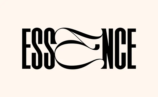
A bold serif display typeface spelling "ESSENCE" with an organic flowing curved line woven through the letterforms, creating a wordmark composition.
Summary
A typographic wordmark featuring bold serif letterforms spelling "ESSENCE" with an organic, hand-drawn curved line flowing through and around the letters, creating a unified compositional gesture.
Visual description
Centered on a warm cream background are large black serif typeface letterforms spelling "ESSENCE" in all capitals. The serifs are prominent and classic. Weaving through and around the letters is an organic curved line—almost calligraphic or hand-drawn in character—that creates flow and connection across the word. The line has variable weight in places, suggesting hand-drawing rather than digital uniformity. The negative space between the letterforms is substantial. The background is a soft warm white or cream tone that makes the black letters and line read with clarity and dignity. The overall composition is balanced and reads as both typographic and illustrative.
Key takeaway
Merging typography and illustration through a flowing organic element: adding a hand-drawn curved gesture to rigid serif letterforms creates personality, elegance, and visual unity without compromising legibility. The contrast between rigid type and flowing line is inherently appealing.
Reuse notes
Excellent reference for luxury brand wordmarks, editorial typography, beauty or wellness branding, and artistic book design. The serif choice communicates sophistication and heritage; the organic curve adds contemporary, artisanal feeling. Adaptable to other words while maintaining the principle of flowing gesture through letterforms. Works well for high-end retail, publishing, and lifestyle brands seeking distinctive typographic identity.
More like this
Keep what you find
A free account saves references to boards and can send you a weekly email of picks based on what you save.
To see every result, go Pro.