Preview image. Unlock full-res
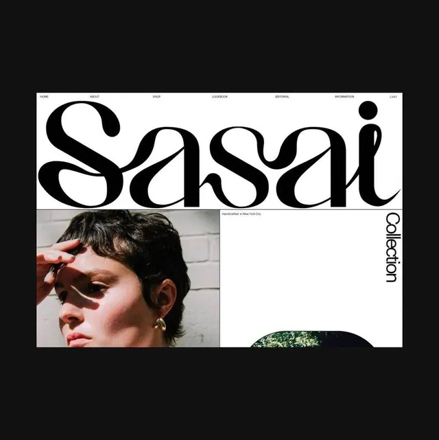
Website header section featuring organic, flowing sans-serif letterforms as the primary brand mark, paired with minimal navigation and product photography on a clean white background.

Summary
A minimalist website header displaying an organic, flowing brand mark rendered in custom sans-serif letterforms, accompanied by a sparse navigation menu and layered product photography sections below.
Visual description
Pure white background with black typography forming large, flowing letterforms that spell the brand name. The letters have organic curves and variable widths suggesting hand-drawn qualities despite being digital. Top-right navigation shows minimal links in small sans-serif capitals (HOME, ABOUT, SHOP, LOOKBOOK, EDITORIAL, INFORMATION, CART). Below the header: a product or lifestyle image on the left showing a person, and additional photography below. Right side text reads "Collection" vertically. The overall composition uses generous white space and relies on typography and photography for visual interest rather than decoration.
Key takeaway
Custom flowing letterforms used as a primary brand identifier create distinction and memorability without requiring a separate mark. The organic quality contrasts elegantly with minimal, geometric layout and navigation.
Reuse notes
Strong pattern for fashion, lifestyle, or design-focused brands. The flowing typography suits luxury or artisanal positioning. Works well for editorial-style e-commerce or portfolio sites. The minimal navigation keeps focus on content and product. Best when the custom typography is distinctive enough to serve as the entire brand identity. Requires confident use of negative space to avoid appearing sparse.
More like this

Keep what you find
A free account saves references to boards and can send you a weekly email of picks based on what you save.
To see every result, go Pro.