Preview image. Unlock full-res
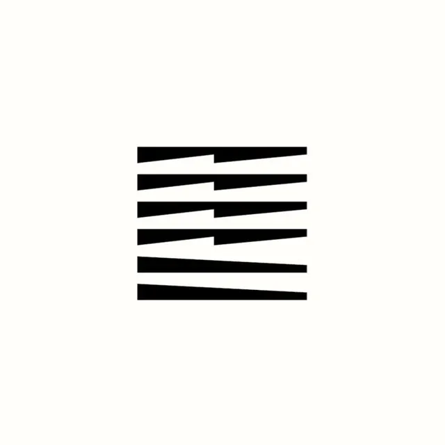
Minimal black mark of six stacked horizontal bars with sharp tapering cuts, forming an abstract louver-like square symbol centered on a cream background.
Summary
A compact abstract symbol built from six horizontal black bars inside an implied square, each bar sliced by long diagonal tapers so the stack reads like angled louvers or shutter blades catching light.
Visual description
The mark sits small and perfectly centered on a large field of warm off-white. The upper four bars are each split near the middle by a wedge-shaped notch, with the left and right halves tapering in opposite directions, producing a subtle zigzag rhythm down the stack. The bottom two bars run full width and taper along their whole length, grounding the composition with heavier, simpler shapes. All edges are crisp vectors; there is no outline, texture, color, or type. The negative wedges do as much work as the black ink, implying depth and rotation in a strictly flat graphic.
Key takeaway
Repeating one primitive (a horizontal bar) and varying only its taper direction creates implied light, depth, and movement with zero extra elements. Generous empty margin around a small dense mark gives it the presence of a carved emblem.
Reuse notes
Reference for logo and symbol design, especially architecture, blinds and shading products, print studios, or any identity wanting a constructed, Swiss-leaning mark. The pattern also tiles well as a brand texture. Its strength is scale-independence: it stays crisp as a favicon and dramatic as a poster. Purely abstract, so it needs naming or context to carry meaning.
More like this
Keep what you find
A free account saves references to boards and can send you a weekly email of picks based on what you save.
To see every result, go Pro.