Preview image. Unlock full-res
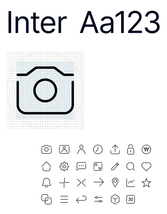
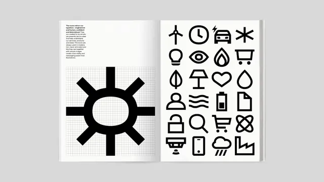
A brand-book spread showing a custom bold-stroke icon set, with one chunky sun mark built on a visible construction grid beside a full pictogram grid.
Summary
An open brand-guideline spread documenting a custom icon language: a single oversized sun pictogram drawn over its construction grid on the left, and a 4-column grid of finished black icons on the right.
Visual description
The page is shown as a printed book mockup on a light grey surface, two near-white pages meeting at the gutter. The left page holds a short justified caption block of small black body copy in the upper-left corner explaining that the icons mirror the typeface, then a large bold sun symbol sitting inside a faint square graph grid that exposes how the mark is built. The right page is a clean grid of roughly two dozen icons rendered in solid heavy black strokes with rounded joins, covering energy and product concepts (wind turbine, clock, car, lightbulb, eye, flame, cart, heart, droplet, battery, lock, magnifier, phone, factory, rain cloud, and more). All marks share one stroke weight and corner radius for a unified set.
Key takeaway
Showing one icon at large scale on its build grid next to the full set, so the page teaches the construction logic, not just the result. A single shared stroke weight and join radius that makes two dozen marks read as one family. Pairing the icon rationale caption directly with the proof grid on the same spread.
Reuse notes
A clean template for the iconography page of any brand or design-system guideline. The heavy-stroke style scales to signage and small UI alike. Keep the construction-grid demo for one hero mark only, repeating it per icon would bloat the page.