Preview image. Unlock full-res
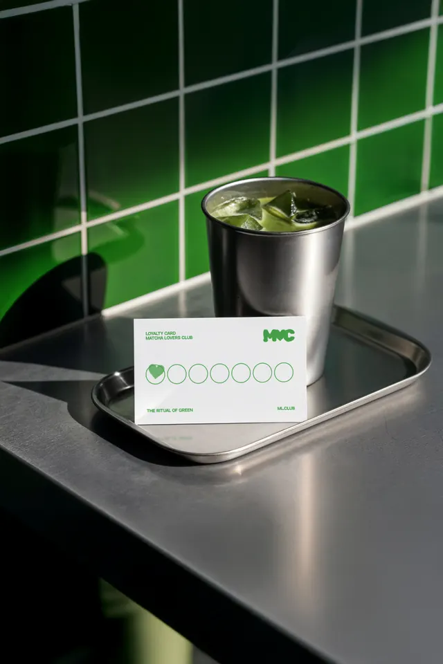
A silver cup with iced green drink sits on a tray beside a white loyalty card with green circles and minimal branding.
Summary
A silver cup with iced green drink sits on a tray beside a white loyalty card with green circles and minimal branding.
Visual description
A stainless-steel cup filled with an iced green beverage sits on a metal tray on a reflective counter. In front of it is a white loyalty card with seven outlined circles and small green text, set against glossy green tiled walls with strong sunlight and shadows.
Key takeaway
Use a tight product still with a single accent color and lots of negative space to make the brand system feel crisp. Pair a simple loyalty card or stamp grid with a real-world object to give the identity tactile context.
Reuse notes
Reach for this when you want a small printed touchpoint to feel premium without adding complexity. It works especially well for cafes, beverage brands, and other physical-first identities that benefit from clean, collectible collateral.