Preview image. Unlock full-res
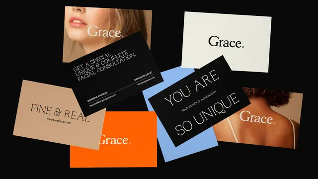
A scattered arrangement of business cards and collateral materials for Grace skincare brand featuring cream, black, orange, and blue accent colors.
Summary
A branding mockup showing multiple collateral pieces for Grace skincare, arranged in a dynamic, overlapping layout with warm earth tones and cool accent colors on a dark background.
Visual description
Six to seven business cards and printed pieces are scattered and overlapped at various angles on a black surface. Each card features the Grace brand identity in different formats: cream and tan cards with serif typography, black cards with white text reading YOU ARE SO UNIQUE, orange cards with the Grace wordmark, blue accent cards, and cards that incorporate beauty product photography. Typography ranges from elegant serif to clean sans-serif. The warm tan/beige tones dominate, with a bright orange card and soft blue accent card providing visual contrast. Small printed details visible include skincare consultation text and brand information.
Key takeaway
The varied card colors and orientations create energy and visual interest while maintaining brand consistency through typography and the Grace wordmark. The warm and cool color accents add sophistication to a potentially simple collateral system.
Reuse notes
Excellent for skincare, beauty, wellness, or professional services branding. The card system is versatile enough to expand with additional colors or finishes. The scattered mockup presentation is effective for Behance or portfolio contexts. Adapt by changing the product category, adding additional card variations, or adjusting the color palette.