Preview image. Unlock full-res
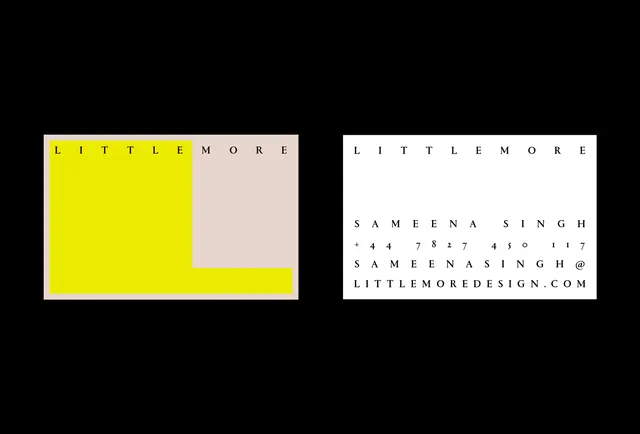
A two-sided business card design featuring bold yellow and cream color blocks with monospace typography showcasing contact information and a designer's branding.
Summary
A striking business card design shown flat, split between a vibrant yellow half and cream half, with a designer's name and contact details in small monospace type.
Visual description
Two business cards displayed front-by-front on a black background. The left card features a bright yellow background with small black monospace type. The right card shows a cream or beige background, also with small black monospace type. Text is arranged in a minimal grid format and includes "LITTLE MORE" (designer name), "SAMEENA SINGH", a phone number, an email address, and "LITTLEMOREDESIGN.COM". The type is all-caps and uses a technical monospace font. No illustration or additional visual elements. The color blocking is pure and geometric, creating bold visual contrast. The cards are positioned to show both versions simultaneously, emphasizing the design system.
Key takeaway
Color blocking with minimal type creates maximum impact on a business card. The high-contrast color and tight typography convey design sophistication through restraint.
Reuse notes
Strong template for contemporary design or agency brands seeking bold, memorable business cards. The two-color system is cost-effective to print while creating visual impact. Monospace type suits tech, creative, or design-focused businesses. The layout is adaptable to different information layouts. The color contrast ensures readability at small scale. Works well as part of a larger identity system. Could adapt colors to brand palette while maintaining the bold-contrast principle. Excellent reference for minimalist identity design.