Preview image. Unlock full-res
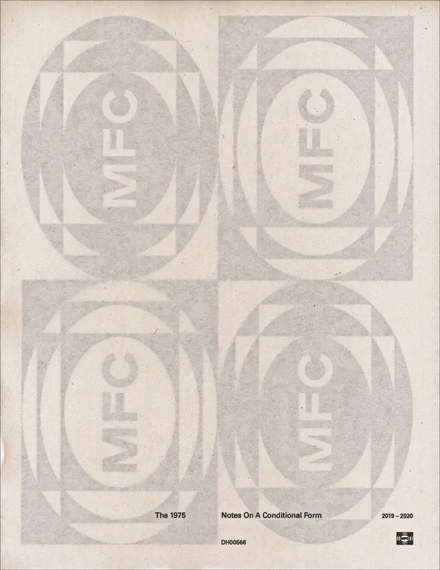
A monochrome poster cover uses a four-panel geometric layout with repeated oval, arch, and square forms around vertically rotated text.
Summary
A monochrome poster cover uses a four-panel geometric layout with repeated oval, arch, and square forms around vertically rotated text.
Visual description
The image shows a pale, textured poster divided into four equal quadrants, each containing layered ovals, arches, and square frames in very light gray. In each quadrant, the word "MFLO" appears rotated vertically, and the bottom margin includes small black text reading "The 1975", "Notes On A Conditional Form", and "2019 - 2020".
Key takeaway
Use repeated geometric modules across a strict grid to create rhythm and variation without adding many elements. Let oversized, rotated typography act as both label and structure inside the composition.
Reuse notes
This approach works well for album packaging, poster systems, and identity graphics that need a restrained but memorable visual language. It is especially useful when you want a quiet, archival look with strong underlying geometry and low-color output.
More like this




Keep what you find
A free account saves references to boards and can send you a weekly email of picks based on what you save.
To see every result, go Pro.