Preview image. Unlock full-res
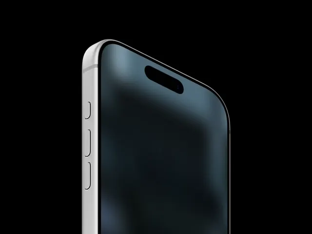
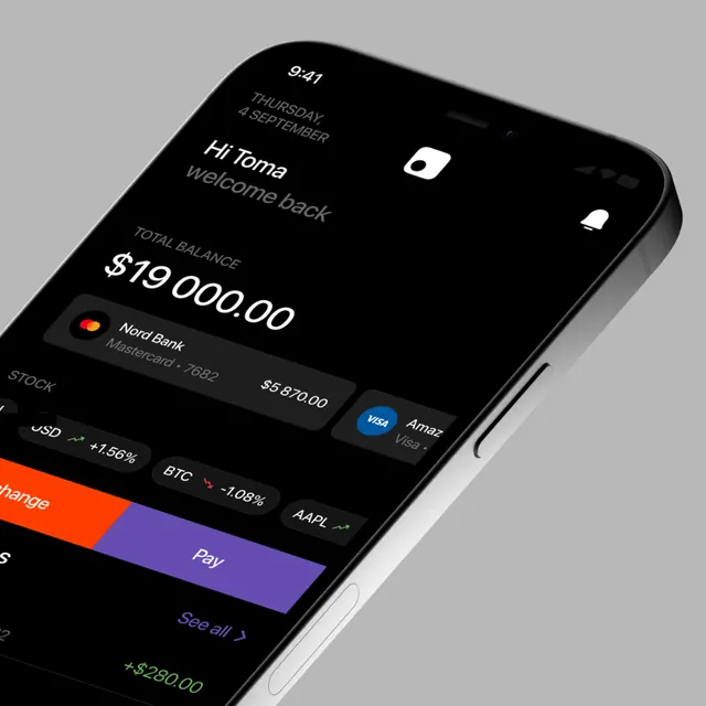
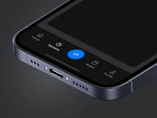
An angled close-up mockup of a dark mobile app interface on a metallic smartphone body with a tab bar visible along the bottom.
Summary
An angled close-up mockup of a dark mobile app interface on a metallic smartphone body with a tab bar visible along the bottom.
Visual description
The image shows a close-up, angled smartphone mockup with a dark app screen and a metallic gray device frame. Along the bottom of the screen are tab bar items labeled Home, Markets, Wallet, and Profile, plus a bright blue circular center button and small line icons.
Key takeaway
Use a restrained dark interface with a single vivid accent button to create hierarchy inside a premium-feeling mobile navigation bar. The angled device mockup and metallic edge treatment add physical realism and make the UI feel product-level rather than flat.
Reuse notes
Reach for this when you need to present a mobile app nav system, especially for finance or utility products. It also works well as a hero image for app showcase pages where the device itself should feel like part of the design language.