Preview image. Unlock full-res
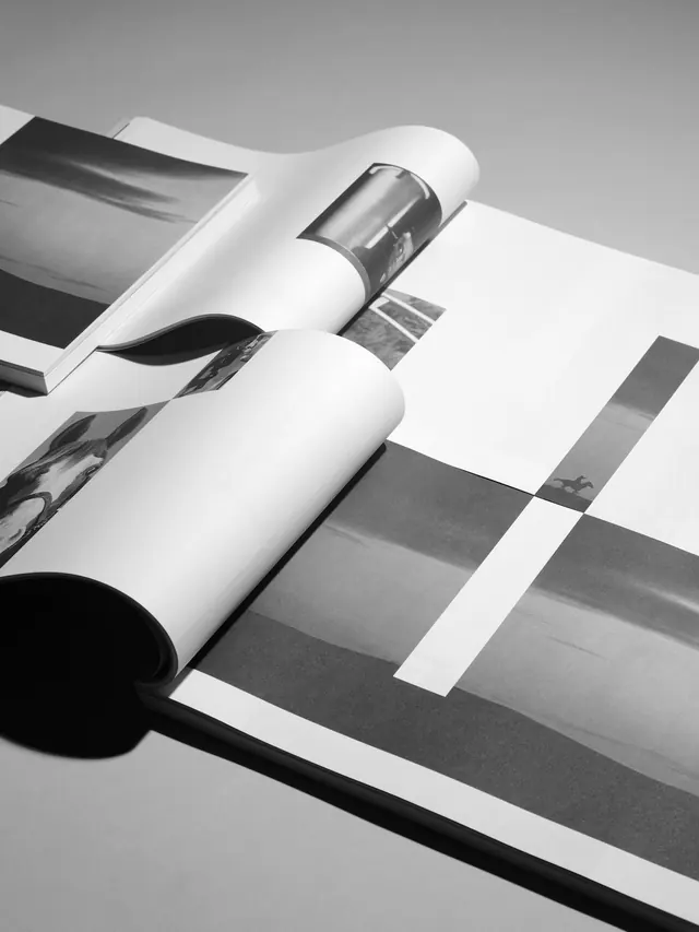
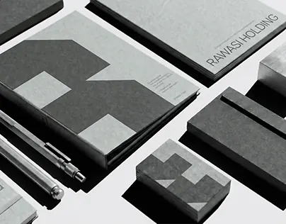
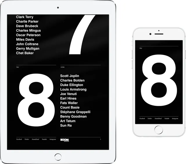
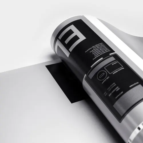
A magazine spread mockup displaying minimalist typography and layout on curved, overlapping pages in monochrome.
Summary
A minimalist magazine mockup with layered, curved pages creating depth and visual interest through composition and subtle typography contrast.
Visual description
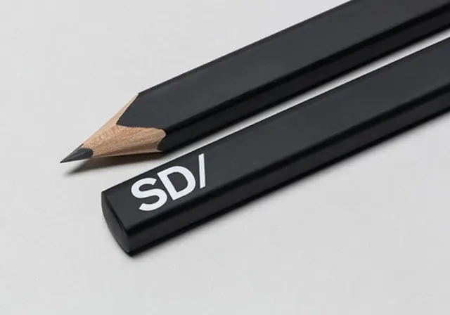
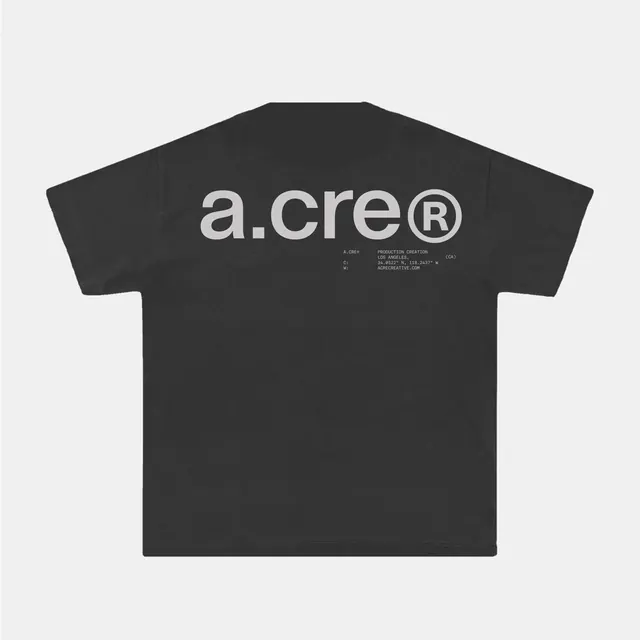
Pages are arranged in an overlapping, curving composition with clean white borders casting soft shadows. The dominant color palette is black and light gray with muted tones. Typography is precise and minimal, with small text indicating a grid-based layout system. The 3D perspective shows multiple pages folded or stacked at different angles.
Key takeaway
The use of curved, overlapping pages to add dimensionality while maintaining a strictly minimal color and typography approach.
Reuse notes
Effective for editorial portfolios, design system documentation, or magazine pitches. Works well when emphasizing layout structure over decorative imagery.