Preview image. Unlock full-res
20-slide design case study for Poulp, a Brazilian financial management app, showcasing the complete identity system, UI design, 3D illustration style, and brand experience across mobile, web, and wearable platforms.

Summary
A comprehensive design project showcase for Poulp, a Brazilian fintech app that reimagines personal finance management. The carousel presents the complete visual identity, product interface design, 3D illustration system, and branded merchandise, demonstrating a cohesive design language built on vibrant gradients, accessible typography, and human-centered messaging.
Visual description
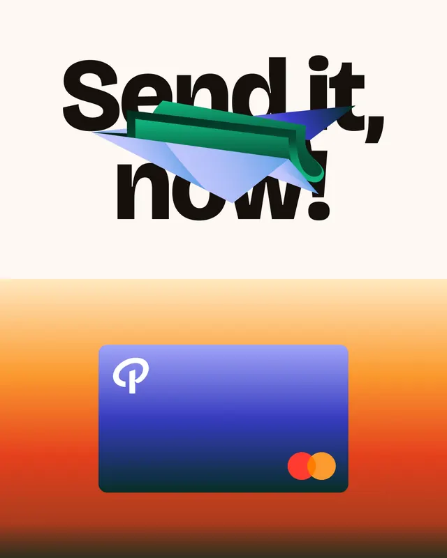
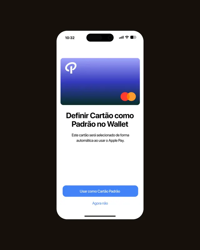
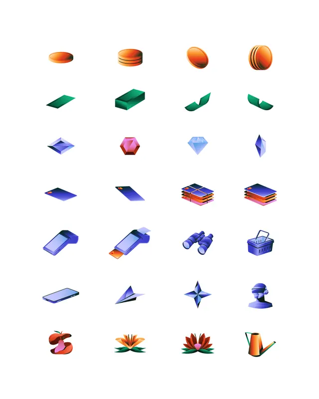
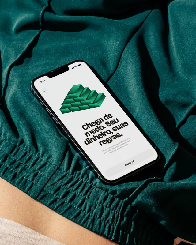
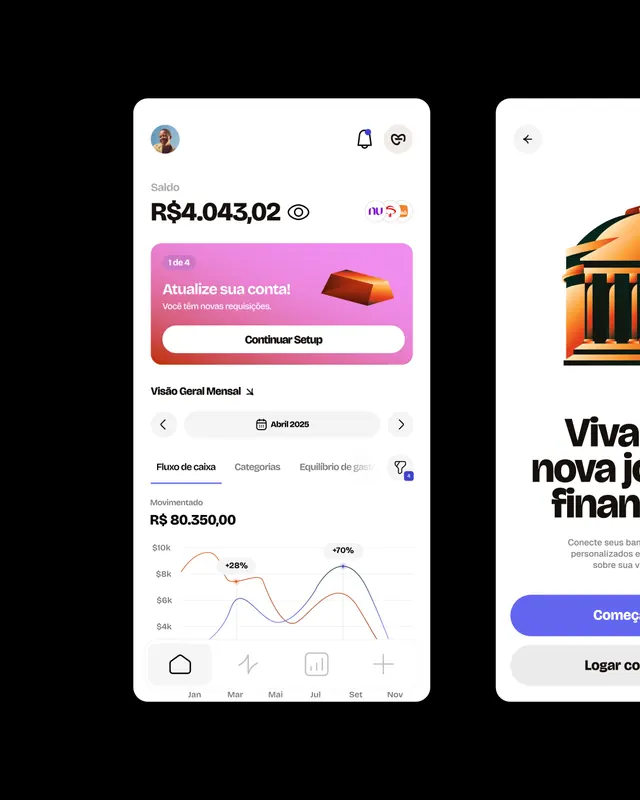
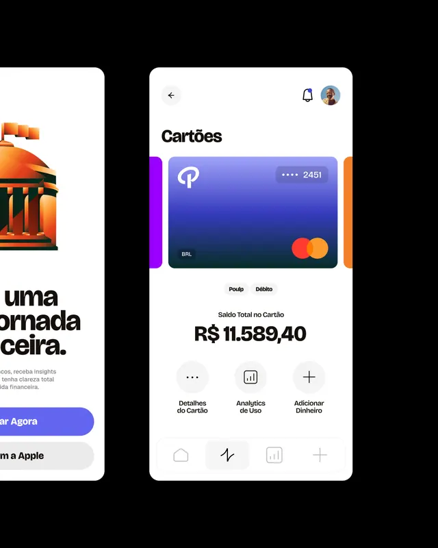
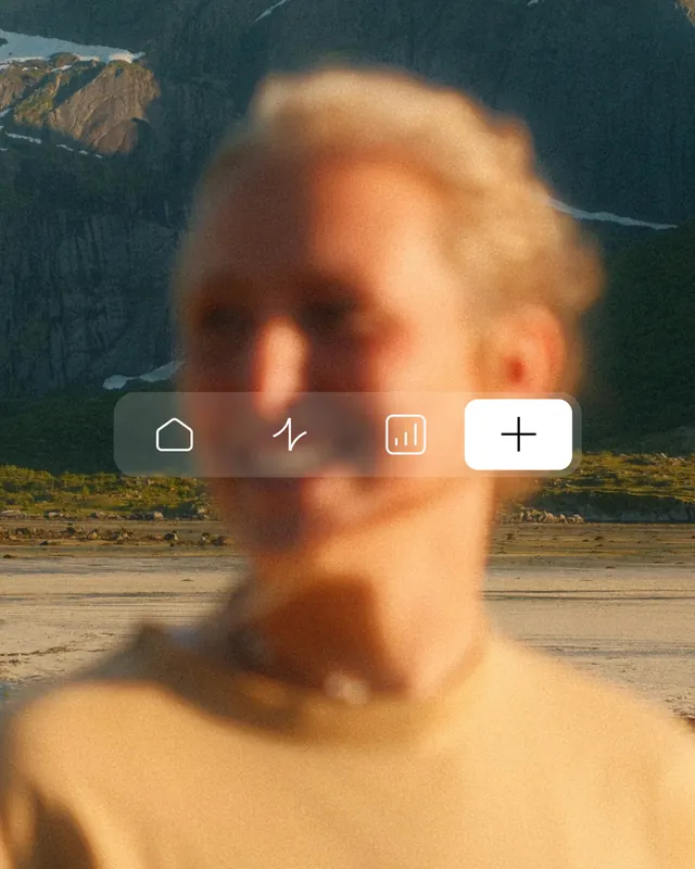
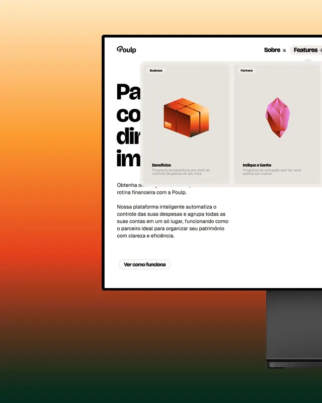
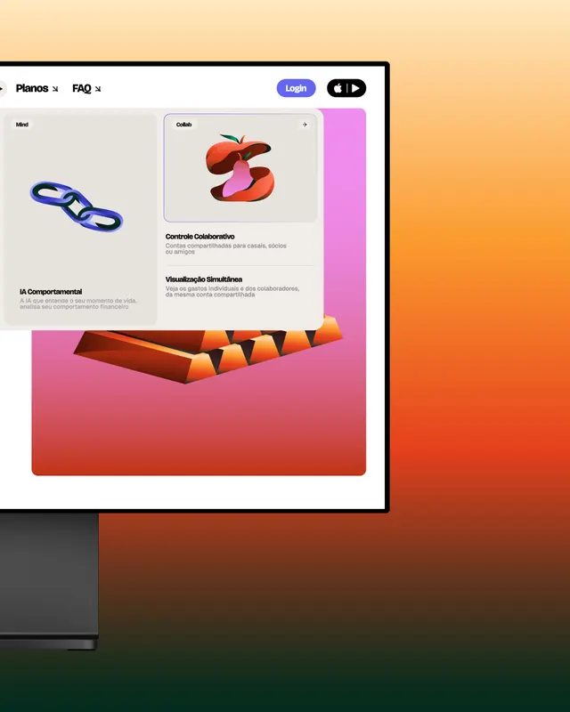
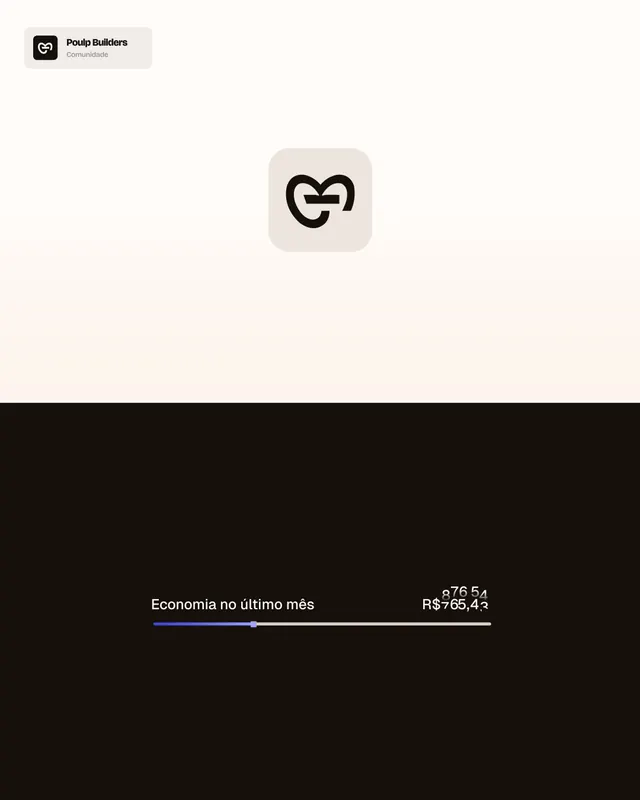
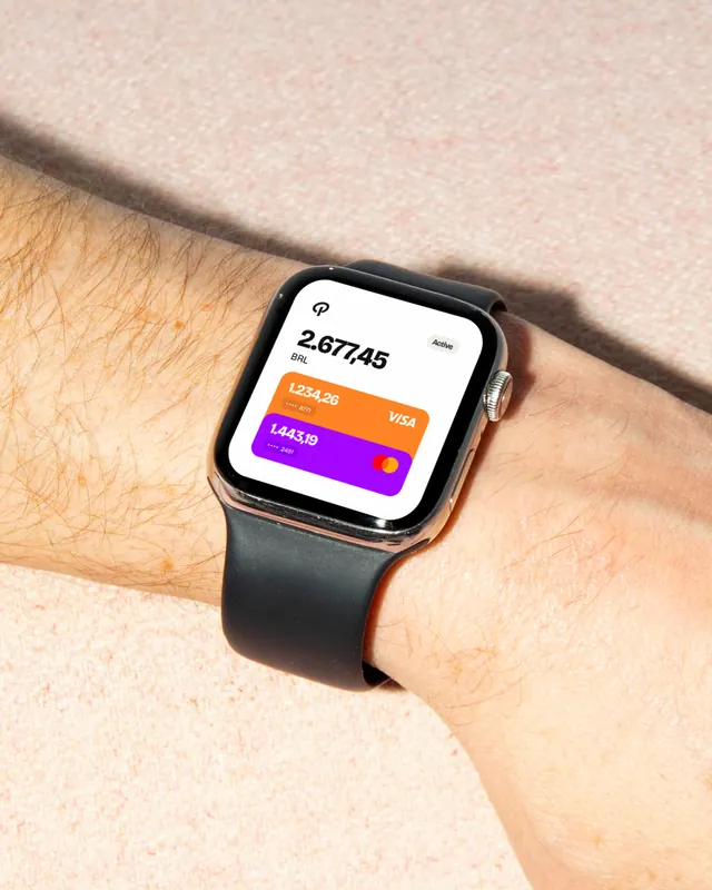
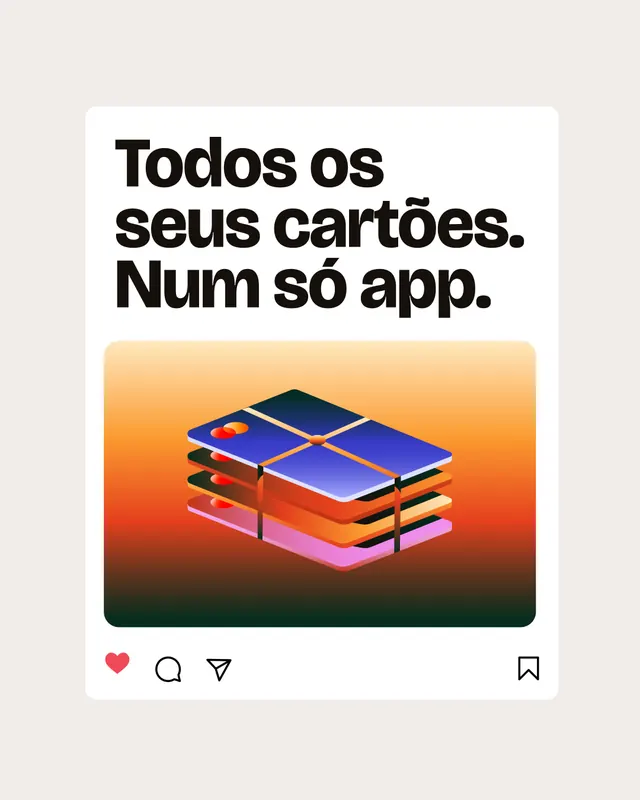
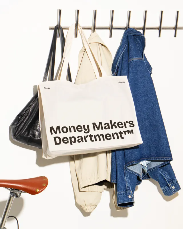
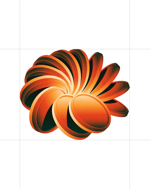
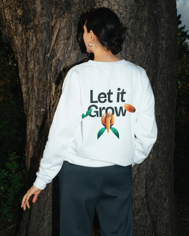
The carousel opens with the Poulp wordmark in light gray on white, then transitions to the primary brand presentation on a rich indigo gradient with white logotype. Early slides establish the marketing narrative with taglines like "Send it, now" paired with stylized payment card illustrations in orange and pink, and "Viva. Curta. Compre. Sem culpa" (Live. Enjoy. Buy. Guilt-free) over isometric 3D cards arranged in a circular composition. Product screens follow, showing the iOS app dashboard with account balance, monthly overview with line charts, and a dedicated cards management interface displaying multiple payment methods (Visa and Mastercard). UI screens are photographed on actual devices, including an iPhone mockup on black background and real Apple Watch footage showing card stack and transaction data. Supporting design system slides showcase a comprehensive icon library with geometric shapes, fruits, and financial symbols rendered in 3D with consistent lighting and shadows in orange, blue, and pink. Lifestyle photography includes product packaging (branded cap, tote bag labeled "Money Makers Department"), and merchandise worn contextually. The website design is shown on a desktop mockup with warm gradient transitions, highlighting features like "Pacodir" (financial planning), collaborative accounts, and behavioral finance messaging. Middle slides include onboarding screens on actual fabric backgrounds, a blurred portrait with bottom navigation, and a community badge for "Poulp Builders." Closing slides feature a decorative 3D flower illustration in layered orange and warm tones, and lifestyle photography of the branded "Let it Grow" sweatshirt on a person in natural outdoor lighting. The entire carousel has animated transitions and motion sequences throughout the video format.
Key takeaway
The consistent use of vibrant gradients, isometric 3D illustration, and oversized sans-serif typography creates immediate visual recognition across all surfaces. The design successfully bridges playful brand personality with serious financial product credibility by mixing human moments (lifestyle photography) with polished UI mockups. Presenting the product in multiple contexts (app screens, watches, websites, merchandise) builds confidence in the breadth and maturity of the design system.
Reuse notes
Strong reference for fintech branding that avoids cold, corporate aesthetics. The gradient color palette and 3D illustration style work well for consumer financial apps targeting younger, more design-conscious audiences. The carousel format itself models an effective case study presentation: establish brand identity, show core product flows, reveal supporting design system, demonstrate real-world applications, and close with lifestyle/cultural touchpoints. Note the heavy reliance on motion and video, which may not translate as effectively in static media; consider the animation as integral to the brand feel rather than optional.