Preview image. Unlock full-res
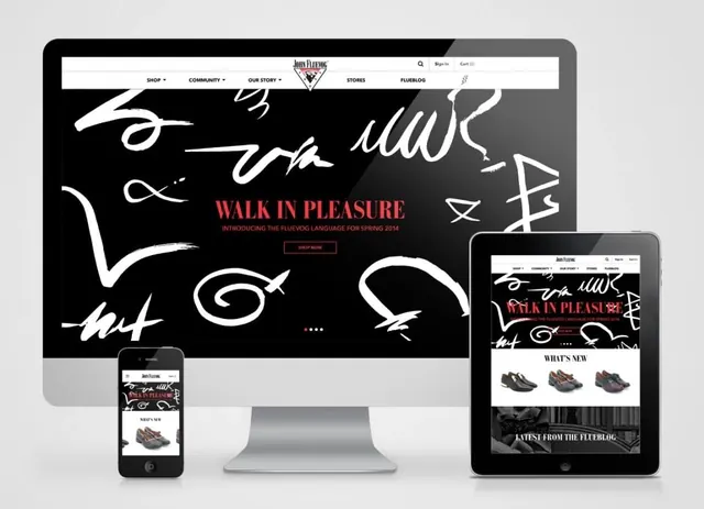
Multi-device responsive mockup showing John Fluevog's "Walk in Pleasure" campaign with handwritten typography, bold red headline, and product showcase across desktop, tablet, and mobile.
Summary
A comprehensive responsive design mockup featuring John Fluevog's "Walk in Pleasure" campaign landing page rendered across three device sizes—desktop, tablet, and mobile—with bold handwritten typography and product imagery.
Visual description
Gray background contains three device frames stacked vertically. Desktop monitor (top): Black background with a navigation bar at top showing John Fluevog logo and menu items. The hero section features large handwritten white script flowing across the black space—loose, expressive lettering. In the center-right, a red sans-serif headline reads "WALK IN PLEASURE" with supporting subtext "INTRODUCING THE FLUEVOG LANGUAGE FOR SPRING 2014." A "SHOP NOW" CTA in red outline sits below. White hand-drawn illustrations and doodles scatter throughout the black space. Below the headline is a "WHAT'S NEW" section with three product thumbnails (shoes). Tablet device (bottom-right): Same layout adapted, with proportions adjusted for the smaller screen but maintaining the same visual hierarchy. Mobile device (bottom-left): Vertical stack adaptation with the handwritten type and red headline condensed but still prominent, product tiles below. All three devices share the black, red, and white palette and the expressive, artistic tone.
Key takeaway
Effective responsive design that maintains visual impact and brand personality across three radically different screen sizes. The handwritten typography and illustrative elements create personality without compromising legibility. Strategic use of negative space (black background) and a single accent color (red) to direct attention.
Reuse notes
Strong reference for fashion, footwear, and lifestyle brands wanting playful yet sophisticated design. Works well for spring/seasonal campaigns and young, energetic brands. The responsive breakdown is particularly useful for e-commerce and product-focused sites. The handwritten + geometric type combination is a reusable pattern. Best when you have compelling product photography and a bold brand voice. The all-caps red headline treatment pairs well with minimal black backgrounds.