Preview image. Unlock full-res
A 12-slide investor pitch for Superlist that pairs gradient fluid-shape bookends with deep-navy content slides, bold grotesque headlines split white-and-coral, and tiny coral eyebrow labels.
Summary
A 12-slide seed/early-stage pitch for Superlist, a task and project management app for remote teams. Its identity rests on three repeated moves: gradient fluid-ribbon shapes bookending the deck, deep-navy content slides carrying oversized grotesque headlines that split into white and coral halves, and a tiny coral all-caps eyebrow labeling each slide's narrative beat.
Visual description
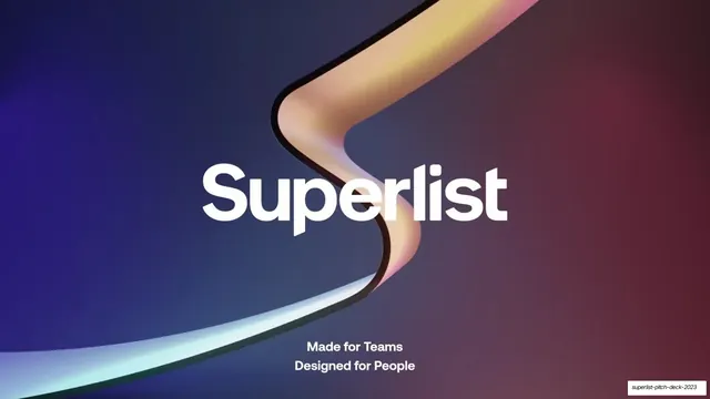
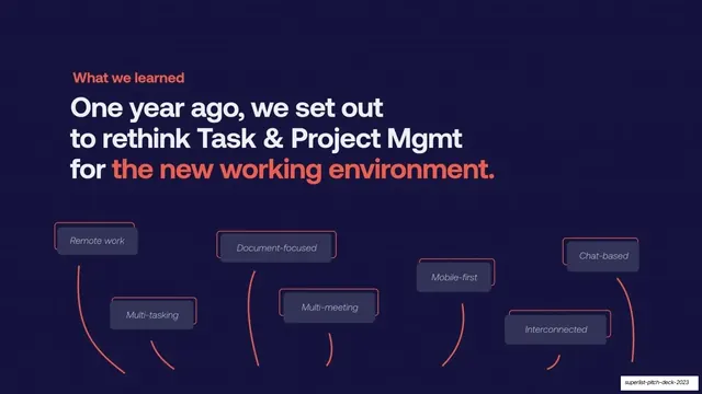
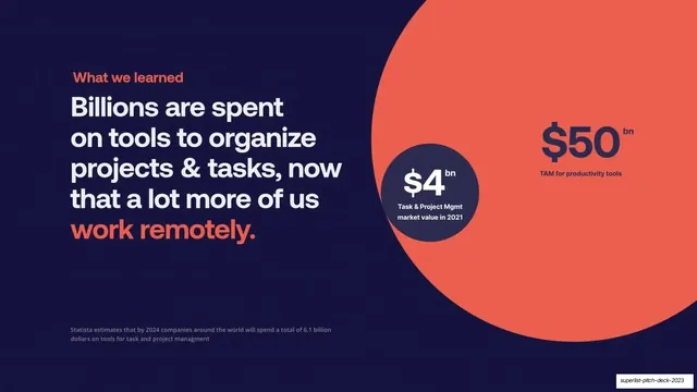
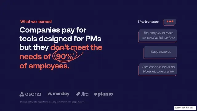
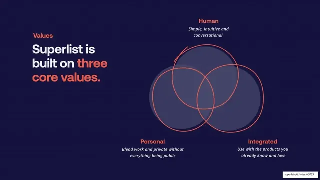
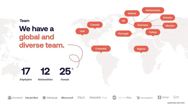
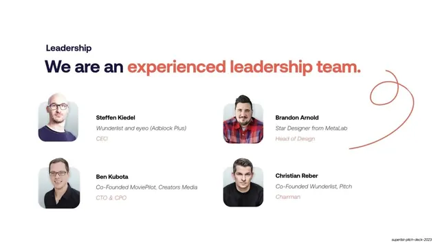
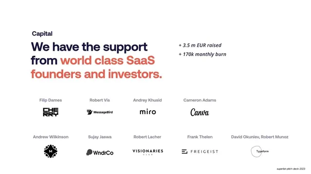
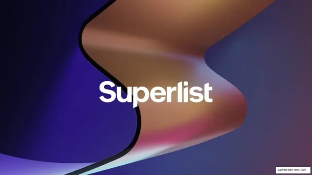
Slides run 16:9. The cover and closing (slides 1 and 12) are full-bleed renders of a glossy 3D fluid ribbon in violet-to-amber-to-pink gradients with the white "Superlist" wordmark centered. The narrative middle (slides 2 to 8) sits on a near-uniform deep navy/indigo (#1A1640) field faintly textured with a dotted grid. Each of those slides leads with a small coral (#F26A4B) all-caps eyebrow ("What we learned", "Values"), then a large geometric grotesque headline set flush-left, with the punchline phrase recolored coral while the rest stays white. The lower band carries the supporting content: four-column logo rows (Slack, Zoom, Notion and an empty Superlist slot that resolves on the next slide), competitor logo strips (asana, monday, Jira, planio), proportional-circle market sizing ($4bn inside $50bn), a coral-outlined chat-bubble shortcomings list, a three-circle Venn of core values, and a tilted product-UI mockup ringed with emoji and chat pills. Hand-drawn coral arrows and loops connect ideas across slides. The three credibility slides (9 to 11: global team map, leadership, investors) flip to a white background with navy text and the same coral accent, using a dotted world map with coral location pills, stat counters, photo-plus-bio rows, and grids of partner and investor logos. The body type is a single bold humanist grotesque throughout; coral is the only accent color across both the dark and light modes.
Key takeaway
The two-tone headline, where the setup is white and the takeaway is coral inside one sentence, so every slide's argument reads in a glance. The gradient fluid-shape bookends that frame an otherwise flat, disciplined deck with one piece of brand drama. And the deliberate dark-to-light flip: navy for the argument, white for the proof (team, investors, traction), which signals a shift from story to evidence without changing the type or accent.
Reuse notes
A strong reference for SaaS or productivity investor pitches and for any narrative deck built on a single accent color over a dark field. The eyebrow-plus-two-tone-headline pattern is directly reusable as a slide template and scales across problem, solution, market, and values beats. The hand-drawn coral arrows add warmth but read as deliberate, not sloppy; keep them sparse. The gradient render is bespoke to Superlist's brand; swap it for your own hero asset. The white credibility slides need real photography, logos, and numbers to land.