Preview image. Unlock full-res
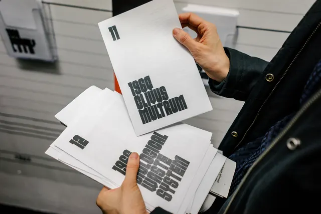
A display of exhibition design materials including white printed sheets and a booklet showing typographic elements and branding from a "Closed Worlds" exhibition, held up by hands.
Summary
Multiple printed sheets and a booklet displayed in hands, showing exhibition collateral with bold all-caps sans-serif typography and a monochrome color system for a "Closed Worlds" exhibition design project.
Visual description
Two hands holding spread printed materials—white sheets with black sans-serif typography printed in structured grids. The top visible sheet shows "CLOSED WORLDS" in bold, outlined letterforms. Additional interior pages display more typographic systems and branding elements in strict black and white. All typography is uppercase and geometric. The materials are photographed flat against a neutral background, emphasizing the clarity and structure of the design system.
Key takeaway
A comprehensive exhibition identity system built entirely on typography and negative space—showing how disciplined typographic choices and a monochrome palette can create a complete, professional brand across multiple collateral pieces.
Reuse notes
Perfect reference for designing exhibition graphics, institution identities, or any project requiring a systematic, typography-forward brand identity. The outlined letterform treatment is particularly useful for creating visual interest in monochrome contexts.