Preview image. Unlock full-res
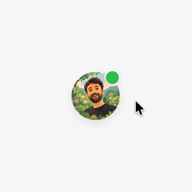
A playful microinteraction concept where hovering a contact avatar reveals animated status option buttons that snap back to a color-coded badge on selection.
More like this
See all
Summary
A playful microinteraction concept where hovering a contact avatar reveals animated status option buttons that snap back to a color-coded badge on selection.
Visual description
A light gray field with a single circular avatar at center, an illustrated bearded man in a lush green foliage scene. A green status dot with a pale ring sits at its top right edge, and a black arrow cursor hovers just below and to the right. The avatar casts a soft drop shadow and everything else is empty.
Key takeaway
Attach the state indicator to the avatar's edge as a pill-ringed dot and let hover expand it into options, so the status control lives exactly where the person is already looking. Keeping the rest of the screen empty makes a tiny microinteraction feel important.
Reuse notes
Reach for this as a motion still reference. Pairs with minimal, playful directions. Original by Nitish Khagwal.
More like this

Keep what you find
A free account saves references to boards and can send you a weekly email of picks based on what you save.
To see every result, go Pro.