Preview image. Unlock full-res
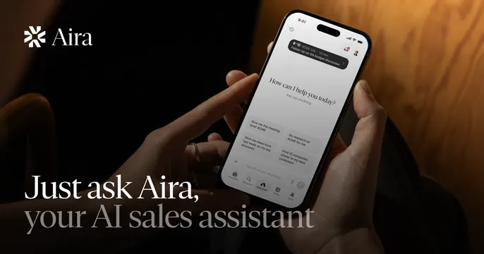
Moody photo of a hand holding a phone showing the Aira app, with a white serif-and-sans headline bottom-left and the logo top-left.
Summary
A warm, dimly lit lifestyle photo of a hand holding a phone running the Aira app, with the headline mixing italic serif and roman sans across the bottom-left. The real product screen in-hand is the focal point.
Visual description
A dark, warmly lit photograph fills the frame: two hands hold an iPhone displaying the Aira app with a "How can I help you today?" prompt and suggestion chips. Behind it is blurred wood paneling in amber light. Top-left, a small white snowflake-style mark and "Aira" wordmark. Bottom-left, a two-line headline reads "Just ask Aira," in white italic serif and "your AI sales assistant" in lighter roman sans-serif beneath it.
Key takeaway
Pairing an italic serif first line with a plain sans second line gives the headline a warm, editorial cadence inside an otherwise techy product shot. Shooting the app in-hand in moody ambient light makes a SaaS tool feel like a premium consumer product.
Reuse notes
Best when you have a polished phone UI and want it to feel human and aspirational rather than clinical. The dark warm grade keeps white type readable; on a brighter photo the headline would need a scrim. Reach for it for consumer-feeling AI or assistant products.
More like this





Keep what you find
A free account saves references to boards and can send you a weekly email of picks based on what you save.
To see every result, go Pro.