Preview image. Unlock full-res
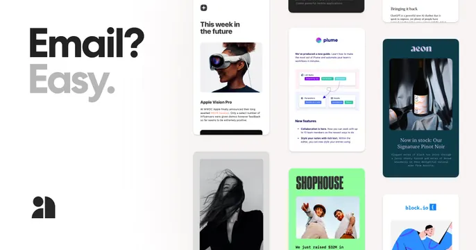
Oversized two-tone "Email? Easy." headline on the left with the logo, beside a masonry collage of colorful newsletter and email cards.
Summary
A bold left-aligned "Email? Easy." headline in black-then-grey with the logo below, set against a right-side masonry wall of varied, colorful email and newsletter template cards.
Visual description
Warm off-white ground. Left third: an oversized headline where "Email?" is solid black and "Easy." drops to light grey, stacked on two lines, with the small black Audienceful logo placed well below in the lower-left corner. The right two thirds are filled edge to edge with a masonry grid of email and newsletter mockups: a "This week in the future" article with an Apple Vision Pro photo, a "plume" product-guide email, a dark "aeon" wine card, a bright green "SHOPHOUSE" funding announcement, a black-and-white portrait, and a "block.io" illustrated card. Cards are different heights, packed tightly.
Key takeaway
The collage as proof of range, showing a dozen finished email styles at once says "you can make anything" louder than copy could. The two-tone headline keeps the left side calm so the busy grid does not overwhelm.
Reuse notes
Best when the product genuinely outputs many visual artifacts (emails, posts, pages). The masonry side needs real, varied, attractive examples or it looks like filler. Keep the headline side mostly empty to balance the density on the right.