Preview image. Unlock full-res
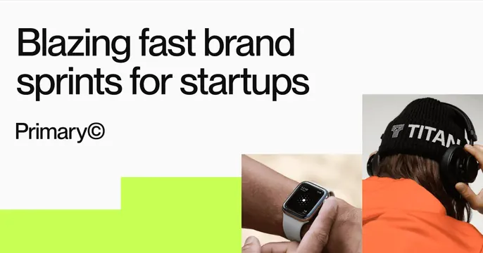
Asymmetric OG card pairing a bold black headline and studio wordmark with two photo tiles and a lime accent shape.
Summary
Asymmetric studio card with a heavy left-aligned headline and "Primary©" wordmark on the left, balanced by two photo tiles and a lime stepped shape on the right.
Visual description
White background. The upper-left holds a two-line headline, "Blazing fast brand sprints for startups," in a bold near-black sans, with the wordmark "Primary©" set smaller just beneath it. The right half carries two photographic tiles: a close-up of a smartwatch on a wrist and, above-right, the back of a person wearing a black "TITAN" beanie and headphones in an orange top. A flat lime-green stepped block anchors the bottom-left corner, the only saturated graphic element. Layout is deliberately off-balance, weighting copy left and imagery right.
Key takeaway
The lime stepped shape as a single branded accent that activates an otherwise black-and-white layout. The asymmetric split, with type held left and a cluster of small photo tiles right, feels like a portfolio fragment rather than an ad.
Reuse notes
Fits a branding agency, design studio, or any service business wanting an energetic, work-forward card. The copyright glyph on the wordmark is a nice studio signal. Swap the photo tiles for client work; keep them small so the headline stays dominant.
More like this


Keep what you find
A free account saves references to boards and can send you a weekly email of picks based on what you save.
To see every result, go Pro.