Preview image. Unlock full-res
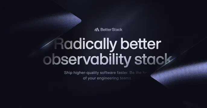
Dark centered OG card with a large metallic-gradient headline, a logo lockup above it, and faceted blue shards on the edges.
Summary
A dark, centered OG card built around a big two-line metallic-silver headline, with the logo lockup above and short sub-copy below.
Visual description
Deep blue-black background carrying a faint dot-grid texture. Centered at top is the Better Stack logo mark and wordmark in muted silver. Below it, an oversized two-line headline, "Radically better observability stack," set in a brushed metallic gradient that runs from dark to bright across the letters. A short two-line tagline in dim grey sits beneath. Angular faceted shards, lit with cool blue highlights, push in from the left and right edges, framing the type.
Key takeaway
The brushed-metal gradient on the headline, which gives flat type a premium, three-dimensional sheen, and the symmetric faceted shards that frame the center without competing with the copy. Centered logo-over-headline-over-tagline is a tidy, repeatable stack.
Reuse notes
Fits a serious developer or infrastructure SaaS that wants polish without color. The metallic type only reads on dark backgrounds with enough contrast range; on light it falls apart. Keep the edge shards subtle so the headline stays dominant.