Preview image. Unlock full-res
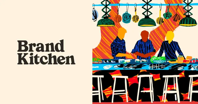
Split OG card with a bold serif wordmark on a cream left panel and a bright hand-drawn illustration of a sushi counter on the right.
Summary
A two-panel card: the wordmark "Brand Kitchen" set in a dark bold serif on a cream left field, paired with a loose, colorful hand-drawn illustration of three people behind a sushi bar on the right.
Visual description
The left roughly 45% is a flat cream panel holding "Brand" over "Kitchen" in a heavy dark charcoal serif, left-aligned and stacked. The right side is a vivid, sketchy marker-style illustration: three figures in blue patterned shirts stand behind a long counter, with hanging accordion pendant lamps above, an orange striped backdrop, and a row of white bar stools in front. The drawing is energetic and imperfect, with visible strokes, scribbled food, and clashing brights (orange, blue, green, yellow, black). No URL or product UI.
Key takeaway
Pairing a restrained, typographically serious wordmark with a loud, loose illustration creates tension that feels like a creative studio. The "kitchen" metaphor is made literal and warm through the sushi-counter scene.
Reuse notes
Strong for an agency, studio, or food/hospitality brand that wants personality over polish. The split keeps the name legible while the art sells the vibe. Caveat: the busy illustration can muddy at small sizes, so the cream-panel wordmark is what carries the thumbnail.
More like this


Keep what you find
A free account saves references to boards and can send you a weekly email of picks based on what you save.
To see every result, go Pro.