Preview image. Unlock full-res
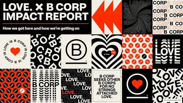
A 30-slide B Corp impact report for UK creative agency LOVE. that pairs a maximalist B Corp color palette with stacked outline-plus-fill grotesque headlines, giant stat numbers, and bento case-study spreads.
Summary
A 30-slide B Corp impact report for the UK creative agency LOVE. Its personality is loud and confident: the full B Corp brand palette (chartreuse, hot pink, electric blue, red-orange, B Corp green) used as flat color blocks, oversized grotesque headlines that stack an outlined word over filled words, and giant single statistics that fill a slide.
Visual description
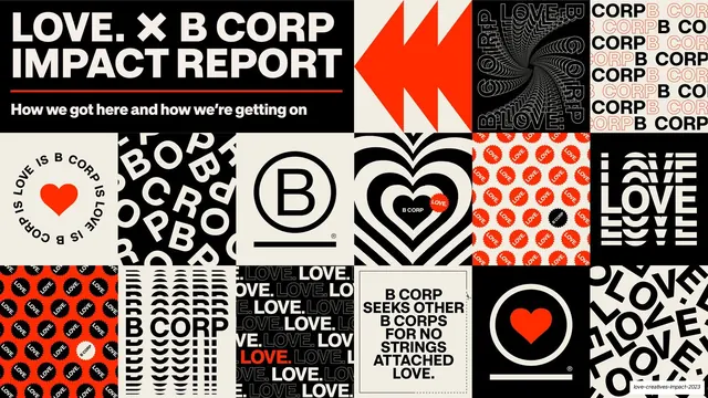
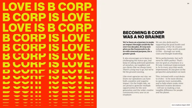
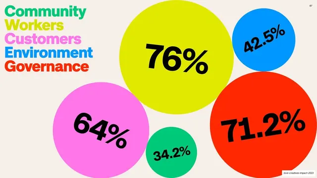
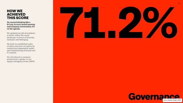
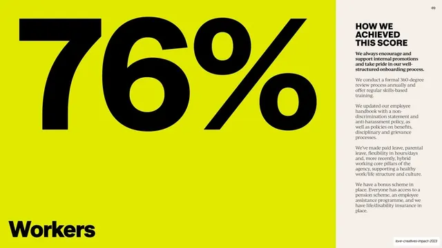
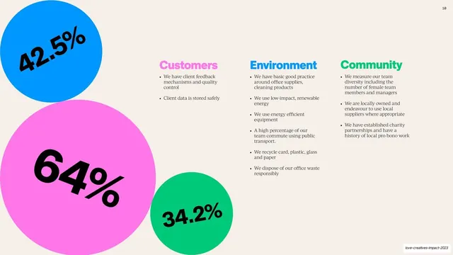
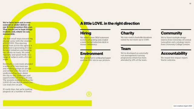
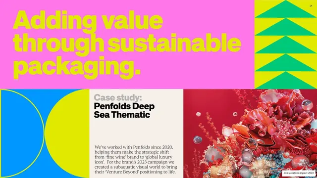
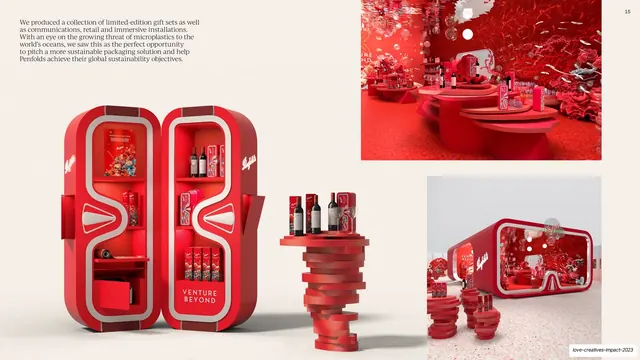
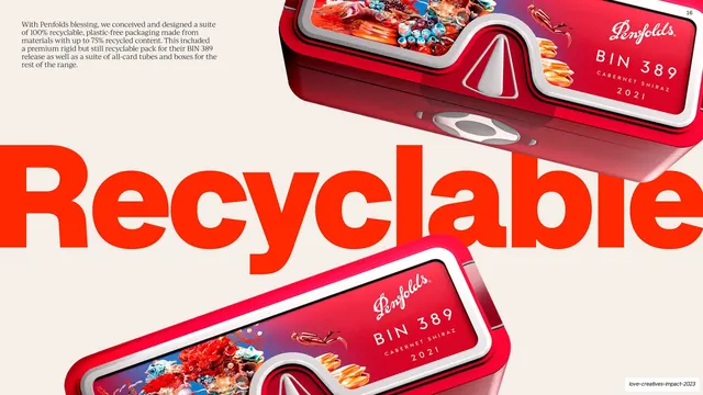
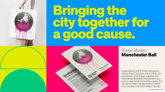
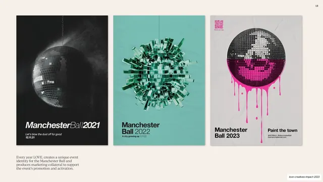
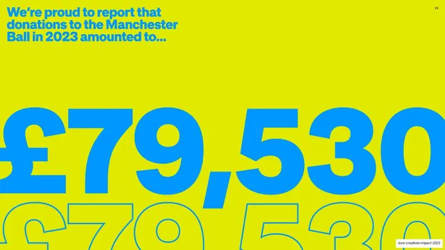
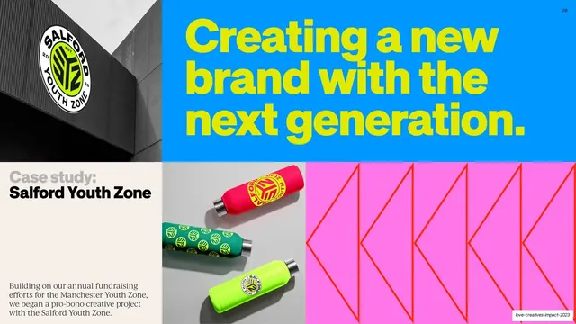
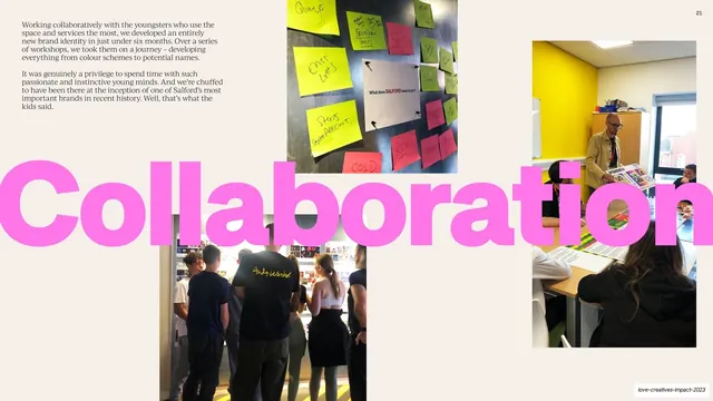
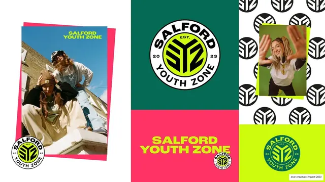
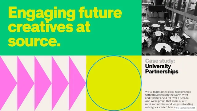
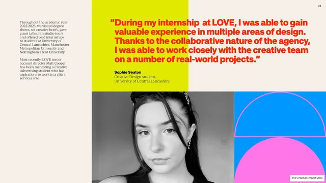
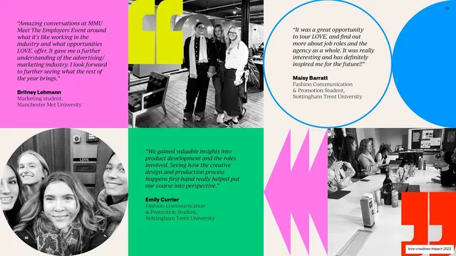
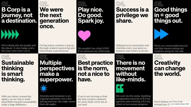
Slides run 16:9. Two type systems carry the whole deck: a heavy geometric grotesque used very large for headlines, frequently set as a stacked pair where one line is an open outline and the next is a solid fill in a contrasting brand color, and a transitional serif used for all running body copy in small multi-column blocks. Backgrounds alternate between a warm cream (#F2EDE4), near-black, and saturated flat fields of the B Corp palette: chartreuse-yellow (#D6E600), hot pink (#FF49C0), electric blue (#1FA0FF), red-orange (#FF3B14), and B Corp green (#16C172). Recurring layout grammar: full-bleed color section dividers with a stacked outline-plus-fill headline and a tiny intro line tucked in a bottom corner; giant stat slides where one percentage or money figure (76%, 71.2%, GBP 79,530) is set enormous, sometimes ghosted as an outline echo behind itself; split editorial spreads with a serif body column on cream beside a flooded color half holding the big number; and bento case-study spreads that tile a pink or color headline panel, a quarter-circle/semicircle geometric block, a "Case study:" label panel, and a photographic or 3D-render image (Penfolds underwater packaging, Manchester Ball disco-ball posters, Salford Youth Zone branding, university photos). Decorative vocabulary is purely geometric and flat: chevron arrows, repeating triangles, multi-point starbursts, concentric heart outlines, semicircles, and circles, all in single brand colors with no gradients or shadows. The cover is a black bento contact-sheet of B Corp logo lockups; testimonial slides tile circular black-and-white portraits with colored quote panels; the deck closes on a 10-cell "B Core Beliefs" grid of numbered black and cream cards and a green outline-plus-fill "This is just the start" sign-off with a contact email.
Key takeaway
The outline-plus-fill stacked headline (one word hollow, the next solid in a clashing brand color) is the deck's signature move and instantly recognizable. The discipline of building an entire report from one flat palette and a strict pairing of a bold grotesque for display with a quiet serif for body, so the loud color never tips into chaos. And the giant single-statistic slide, with the number ghosted as an outline behind its filled self, as a high-impact way to land one metric.
Reuse notes
A strong reference for B Corp, ESG, CSR, and sustainability impact reports, and for any agency or brand annual that wants to feel energetic and human rather than corporate. The color-block section divider, giant-stat slide, and bento case-study spread are directly reusable templates. The approach leans on a full saturated palette and flat geometric shapes, so it works best for a brand that already owns bright colors; it would need toning down for a conservative or luxury audience. The serif body copy runs small and dense in places, so watch legibility at presentation distance.