Preview image. Unlock full-res
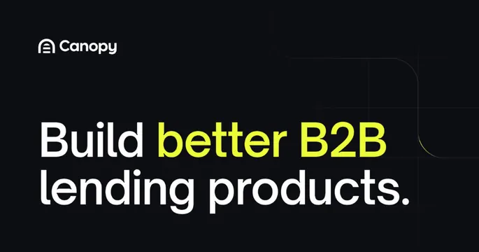
Dark minimal OG card with a logo lockup and a large two-tone headline whose middle words are highlighted in lime.
Summary
A dark, text-driven OG card carrying a logo lockup top-left and a bold two-line headline where the phrase "better B2B" is recolored lime against white. The single lime accent on an otherwise monochrome card is the defining move.
Visual description
Near-black background. Top-left shows the Canopy mark and wordmark in white. Centered-left, a heavy two-line sans-serif headline reads "Build better B2B lending products," with "better B2B" set in bright lime-yellow while the rest stays white. A subtle thin rounded-corner line traces the upper-right area as a faint geometric flourish, and a hint of lime hairline appears at the right edge. No imagery or UI, just type and negative space.
Key takeaway
Driving the whole card with type and letting one lime phrase do all the color work. The faint rounded corner-line in the upper right adds quiet structure to a near-empty dark canvas without competing with the headline.
Reuse notes
A reliable, fast-to-template pattern for a fintech or developer-facing B2B brand that wants confidence and restraint. The lime-on-black contrast is the hook, so it depends on a bright accent color in the brand kit. Easy to scale because there is no detail to lose.
More like this


Keep what you find
A free account saves references to boards and can send you a weekly email of picks based on what you save.
To see every result, go Pro.