Preview image. Unlock full-res
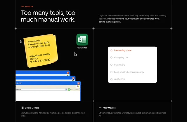
Black 2x2 grid contrasting manual logistics clutter with single Melrose automation checklist card.
Summary
Problem section uses quadrant layout: red THE PROBLEM headline, explanatory copy, chaotic Before Melrose tool collage, and clean After Melrose automation card.
Visual description
Black grid with crosshair dividers. Top left red label and white headline Too many tools, too much manual work. Top right gray paragraph on re-entering data and Melrose connecting operations. Bottom left Before Melrose shows yellow sticky note with fees and phone number, Excel Our Quotes icon, stacked blue legacy windows, scattered cursors, and caption on disconnected tools. Bottom right After Melrose presents one white rounded checklist Calculating quote active with orange spinner plus pending Accepting DO, Parsing DO, email when truck nearby, and Verify POD steps with streamlined automation caption.
Key takeaway
Literal clutter versus one card makes automation value obvious without animation. Skeuomorphic sticky notes and XP windows add humor to painful reality.
Reuse notes
Strong for ops software positioning. Before side needs recognizable pain artifacts; generic icons weaken the contrast.
More comparison sections
See all











More like this


Keep what you find
A free account saves references to boards and can send you a weekly email of picks based on what you save.
To see every result, go Pro.