Preview image. Unlock full-res
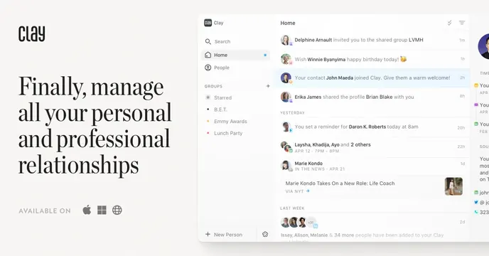
Split OG card with an oversized serif headline on the left and a detailed contacts-feed app screenshot on the right.
Summary
A split card pairing a large four-line serif headline on a cream ground with a realistic personal-CRM app screenshot, defined by its editorial serif type.
Visual description
Warm off-white background. The left column shows a small "Clay" wordmark at top, then an oversized black serif headline across four lines: "Finally, manage all your personal and professional relationships". Below it, muted small-caps "AVAILABLE ON" sits beside Apple, Windows, and web glyphs. The right column holds a rounded app screenshot of a relationship feed: a left sidebar (Search, Home, People, Groups with Starred, B.E.T., Emmy Awards, Lunch Party) and a main column of dated activity items about contacts, each with an avatar. The UI bleeds off the right edge.
Key takeaway
Using a refined serif at large size to make a contacts tool feel personal and premium rather than corporate, then proving the product with a dense, believable feed screenshot beside it.
Reuse notes
Good for a consumer or prosumer app that wants warmth and editorial polish. The cream background and serif do a lot of the mood work. Needs a populated, realistic UI so the right side does not look empty.