Preview image. Unlock full-res
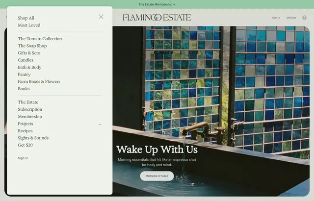
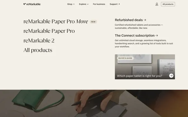
Light cream Shop dropdown with oversized serif product links on the left, subscription and guide cards on the right, over a lifestyle product photo.
Summary
A full-width Shop mega menu that pairs large serif product names with supporting subscription and buyer-guide cards, sitting above a cropped lifestyle tablet photo.
Visual description
Warm off-white overlay covers the page below a slim top bar with the reMarkable wordmark, Shop/Explore/For business/Support links, a profile icon, and an outlined All products button. Left column lists product entries in oversized black serif: reMarkable Paper Pro Move with a small NEW pill, reMarkable Paper Pro, reMarkable 2, and All products. Right column holds two text links with arrow affordances (Refurbished deals, The Connect subscription) each with muted sans descriptions, plus a rectangular buyer-guide card showing three wall-mounted tablets, a BUYER'S GUIDE badge, white overlay headline Which paper tablet is right for you?, and a circular arrow button. The menu floats over a partial hero image of a hand writing on a tablet beside a green folio.
Key takeaway
Serif product names at navigation scale make hardware feel editorial rather than catalog-like. Secondary column mixes utility links and a visual card without crowding the product list. Letting the page hero peek through the menu keeps context and depth.
Reuse notes
Strong pattern for hardware or lifestyle brands with multiple SKUs and a subscription upsell. Needs generous horizontal space; collapses poorly on mobile without a different pattern. Cream palette and serif/sans pairing carry the premium tone.