Preview image. Unlock full-res
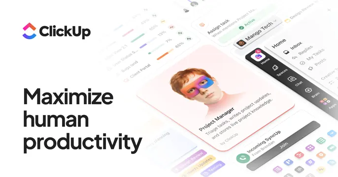
Split OG card with a bold black headline and logo on white beside a layered, colorful collage of product UI fragments and a portrait.
Summary
A split card with the logo and a short three-line black headline on white, balanced by a busy, layered collage of colorful app UI cards and a centered portrait.
Visual description
White background. Top-left holds the gradient ClickUp logo mark and black wordmark. Below it, a left-aligned three-line black sans-serif headline reads "Maximize human productivity". The right two-thirds is a dense, slightly faded collage of overlapping product fragments: dashboard tables, task chips, a dark right-edge nav of app icons, and a sharper centered white card showing a "Project Manager" entry with a portrait of a person whose face wears a pink-and-blue painted mask. Many small colorful app icons scatter along the bottom edge.
Key takeaway
Letting one crisp focal card (the masked portrait) sit in front of a deliberately soft, busy collage of the rest of the product, so the card shows breadth without overwhelming the single headline.
Reuse notes
Suits broad, do-everything platforms that want to signal range and energy. Keep the headline short and high-contrast so it holds against the busy right side. Risk of clutter if the background collage is not faded back.