Preview image. Unlock full-res
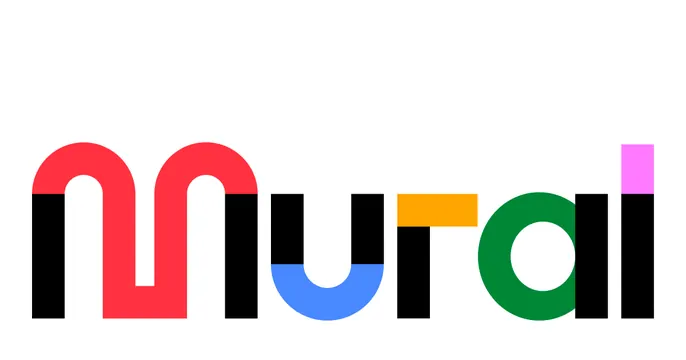
White OG card showing only the Mural wordmark logo, each letter built from a different bright primary color over black bars.
Summary
A plain white Mural OG card that shows nothing but the brand wordmark, where each letter is a distinct rounded shape in a different bright color stacked on black bars. The logo alone is the entire card.
Visual description
Pure white background. Centered slightly low is the lowercase "mural" wordmark rendered as a geometric, rounded-terminal logotype: a red "m" formed from two arches, a blue "u" bowl, an orange crossbar, a black stem, and a green "a/l" group with a magenta cap, all sitting on short vertical black bars that act as letter stems. The letterforms read as modular, almost sticker-like shapes. No headline, tagline, or URL; pure brand identity.
Key takeaway
The confidence of a logo-only OG card: when the wordmark is colorful and distinctive enough, it needs no supporting copy. Building each glyph from a separate primary color plus black bars makes a memorable, toy-like brand signature.
Reuse notes
Only viable when the brand mark is strong and recognizable on its own; a plain text logo would look empty at this scale. Best for an established collaboration or creativity brand. Pairs with a white or very light background so the colored letters stay punchy.