Preview image. Unlock full-res
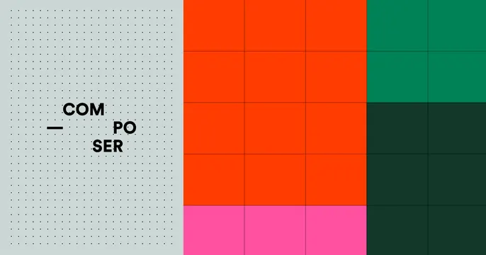
Split card pairing a dotted-grid panel holding the stacked COM-PO-SER wordmark with a blocky color-grid of orange, green, and pink modules.
Summary
A two-zone card: a left panel of fine dotted texture holds the brand name stacked in three lines, while the right two-thirds is a grid of solid color blocks. Geometry and color carry the whole composition.
Visual description
The left third is a pale grey-green field filled with an even dot grid; over it the name reads "COM / PO / SER" in black bold all-caps, staggered and aligned to the right with a short em-dash tick set beside the middle line. The right two-thirds is a flat modular grid of rectangles: a large bright-orange block, a deep-green block top-right, a dark forest-green block lower-right, and a row of hot-pink cells along the bottom, all separated by thin dark gridlines. No tagline or URL; the layout is purely wordmark plus abstract color grid.
Key takeaway
Pairing a quiet textured panel for the name with a loud, gridded color field that does the visual heavy lifting. The staggered three-line lockup plus the em-dash tick turns a plain word into a structured mark.
Reuse notes
Good for fintech, data, or developer tools wanting a systematic, modular look without product imagery. The split lets you keep the name perfectly legible while still feeling colorful and energetic. Swap the block colors to rebrand quickly.
More like this




Keep what you find
A free account saves references to boards and can send you a weekly email of picks based on what you save.
To see every result, go Pro.