Preview image. Unlock full-res
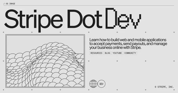
Light gray technical card mixing a clean and pixelated "Stripe Dot Dev" headline with a line-art topographic globe and resource link tags.
Summary
A light-gray developer card with a large two-tone headline, "Stripe Dot" in a clean sans and "Dev" in a pixel font, over a layout marked by a plus-sign grid, a framed line-art topographic blob, supporting copy, and four bordered link tags.
Visual description
Light gray background with a small "/ OG IMAGE" label and rule at the top. The big headline spans the top: "Stripe Dot" in a smooth black sans-serif and "Dev" rendered in a blocky pixel/bitmap face. The lower area is organized on a faint grid of small plus marks. Bottom-left holds a thin-bordered rectangle containing a black-and-white contour/topographic line drawing of rolling forms. Bottom-right has three lines of dark body copy ("Learn how to build web and mobile applications to accept payments...") above four outlined tag buttons: RESOURCES, BLOG, YOUTUBE, COMMUNITY. A small globe icon and a "DEV" circle sit beside them, with "(C) STRIPE, INC." in the corner.
Key takeaway
Mixing a clean sans with a pixel font in a single headline marks the "dev" sub-brand without a separate logo. The plus-mark grid and thin-framed line illustration give a precise, engineering-doc feel; outlined link tags hint at navigation inside a static card.
Reuse notes
Purpose-built for a developer hub or docs/resources landing. The monochrome, grid-driven, technical-blueprint look suits engineering audiences. Busy with elements, so keep them aligned to the grid; the pixel-font accent is the key brand signal.