Preview image. Unlock full-res
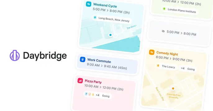
White OG card with the Daybridge logo on the left and a cluster of soft pastel calendar event cards with map snippets scattered on the right.
Summary
A clean, airy take on the Daybridge OG card, placing the logo on plain white beside softly tinted calendar event cards with maps scattered on the right.
Visual description
A plain white background. The left side holds the Daybridge logo mark and black wordmark, vertically centered. The right side is filled with overlapping rounded event cards in pale pastel fills tilted at gentle angles: a teal Weekend Cycle card over a blue map of Long Beach, a blue Work Commute card, a pink Pizza Party card with going-avatar chips, a yellow Comedy Night card over a tan map near Colorado Free University, a faint hidden-event card, and a green London Piano Institute card. Each uses a colored icon, event title, time range and small map or avatar detail.
Key takeaway
The lighter, white-ground variant of a card-collage product card: the same fanned event cards read calmer and more premium in soft pastels on white than on a saturated gradient. The black logo on white keeps the brand crisp.
Reuse notes
A good alternative when a brand wants the feature-rich card collage but a quieter, more minimal mood. Works for calendar and planner apps with pastel-coded categories. As with any dense UI collage, keep sample content varied and legible so it survives feed-size downscaling.