Preview image. Unlock full-res
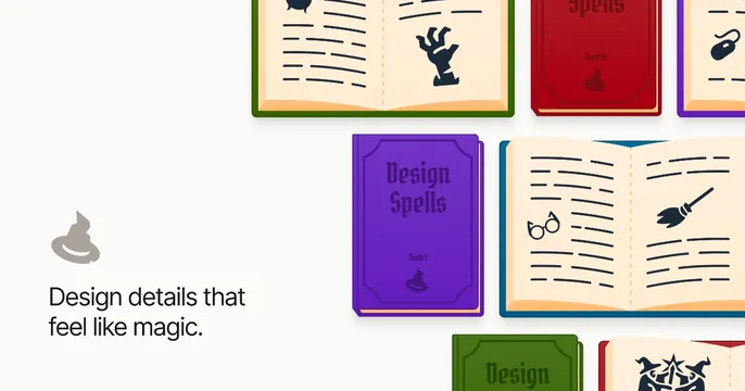
Playful white card with a left "Design details that feel like magic." line and a right grid of colorful illustrated spellbooks.
Summary
A whimsical card that frames great design details as magic by tiling colorful illustrated spellbooks beside a short, warm headline.
Visual description
Light off-white background. The left third is clean: a grey sorting-hat icon above a black sans-serif headline "Design details that feel like magic." The right two thirds are filled with a tilted grid of cartoon spellbooks rendered in flat color with gold edges, several lying open to cream pages with handwritten-style lines and tiny black icons (a reaching hand, round glasses, a flying broom, a witch hat). Closed covers in purple ("Design Spells, Book I"), red, and green carry the same small hat emblem. The arrangement bleeds off the right and bottom edges.
Key takeaway
Committing fully to one playful metaphor (a wizarding library) so even the supporting illustrations reinforce the brand promise. The clean left column keeps the message readable against a rich illustrated field.
Reuse notes
Great for a fun, community-driven content brand or newsletter where charm is the point. The split keeps copy legible while the illustration sells the vibe. Custom illustration is the cost of entry here; stock art would undercut the magic angle.