Preview image. Unlock full-res
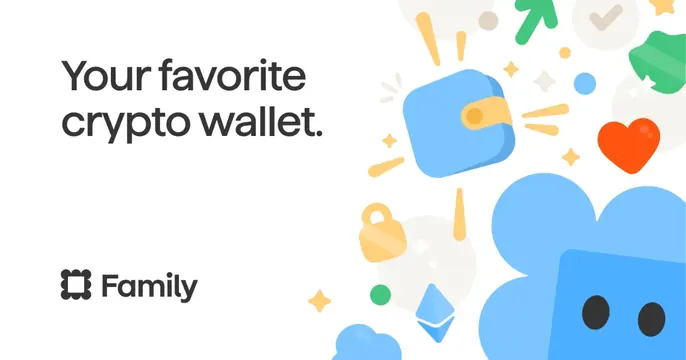
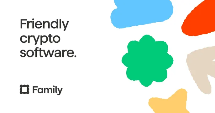
Left-aligned OG card with the headline "Friendly crypto software." and a wordmark over playful torn-paper color blobs on white.
Summary
A clean white crypto card that splits text and graphic: a three-line lowercase headline and the Family wordmark on the left, a scatter of bright torn-paper color shapes on the right.
Visual description
On a plain white background, the left half carries the headline "Friendly crypto software." set in a dark, rounded sans-serif across three lines, with the Family logo (a bracket-style monogram) plus the wordmark anchored below it. The right half is filled with loose, organic torn-paper-style blobs in sky blue, red-orange, beige, green, and yellow, the green one shaped like a soft rounded flower at the center. The look is airy and high-contrast, with lots of white breathing room around the type.
Key takeaway
Pairing a strictly typographic, left-aligned message with a freeform splash of brand-color shapes on the opposite side keeps the card friendly without clutter. The torn-paper edges add craft and warmth to an otherwise minimal layout.
Reuse notes
Strong template for a consumer fintech or crypto brand that wants to read approachable rather than technical. The format scales: swap the headline and recolor the blobs to fit any palette. Keep the shape cluster off to one side so the wordmark stays legible.