Preview image. Unlock full-res
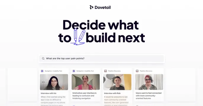
Clean white card with a centered Dovetail logo, an oversized "Decide what to build next" headline with a hand-drawn pencil accent, a search bar and a row of insight cards.
Summary
A bright white card laid out like a product hero: centered logo, a big headline with a pencil doodle, a search field, and a row of user-insight cards peeking up from the bottom.
Visual description
Clean white background. Centered at the top is the Dovetail logo and wordmark. Below, an oversized near-black headline reads "Decide what to build next," with the word "to" underlined by a violet hand-drawn double-pencil doodle that adds a playful accent. Under the headline sits a wide rounded search bar with the placeholder "What are the top user pain points?". Beneath that, a row of four white insight cards rises from the bottom edge, each labeled (Navigation, Usability Test, Playlists Discovery), showing a video thumbnail of a person and a quote about user feedback. Faint empty cards flank the row.
Key takeaway
The pencil doodle over one headline word injects personality into an otherwise corporate-clean layout. Showing a real search query plus result cards demonstrates the product's core loop right on the card.
Reuse notes
Good for a research or analytics SaaS that wants to look polished but human. The doodle accent is the differentiator from a generic centered hero. Needs legible card thumbnails; keep the background pure white so the UI reads.