Preview image. Unlock full-res
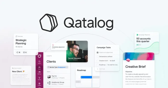
Light OG card with a centered logo lockup surrounded by scattered floating product UI cards.
Summary
A centered logo lockup ringed by a constellation of small floating product cards, showing a work-hub SaaS at a glance.
Visual description
A pale blue-grey background with faint concentric guide rings. Dead center sits a black hexagonal mark beside the "Qatalog" wordmark. Orbiting it are loosely scattered, overlapping UI fragments rendered as soft white cards: a "Strategic Planning / 15 Clients" service tile, a "Clients" list with avatars and a magenta side-nav, a photo card of a "Darrell Steward" project manager, a "Campaign Tasks" checklist, a "Roadmap" mini-timeline, a "Campaign Objective / 50 accounts this quarter" card with a green sparkline, and a "Creative Brief" text panel. The cards drift outward toward the edges, leaving the logo in clear space at center. Magenta is the recurring UI accent against the otherwise neutral palette.
Key takeaway
Orbiting real product cards around a centered logo to suggest a single hub that ties many tools together, perfect for an all-in-one workspace pitch. The concentric guide rings subtly reinforce the "everything revolves around this" idea.
Reuse notes
Best for a platform or hub product with many surfaces to show. Keep the central logo in a clean pocket and let the cards fade or crop at the edges so the composition feels expansive, not cramped. A single UI accent color across all the cards is what keeps the scatter coherent.