Preview image. Unlock full-res
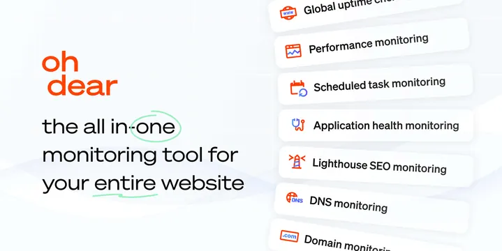
Light OG card with a two-tone stacked wordmark and headline on the left and a vertical stack of feature cards with red line icons on the right.
Summary
A light, airy Oh Dear card with a two-tone stacked wordmark and headline on the left and a vertical stack of white feature cards, each with a red line icon, on the right.
Visual description
Pale blue-gray background with a faint grid and soft wave graphics. The left side stacks the brand: "oh" in orange over "dear" in a heavier orange, then the headline "the all in-one monitoring tool for your entire website" in black, with a hand-drawn green circle looping the word "one" and a green underline scribble beneath "entire website" for a casual, human touch. The right side is a descending stack of rounded white cards, each holding a small red-orange line icon and a feature label: Global uptime checks, Performance monitoring, Scheduled task monitoring, Application health monitoring, Lighthouse SEO monitoring, DNS monitoring, Domain monitoring. The cards bleed off the top and bottom edges to imply a longer list.
Key takeaway
The hand-drawn green circle and underline add personality and direct the eye inside an otherwise tidy, corporate-clean layout. Listing many feature cards that bleed off both edges signals breadth ("all-in-one") more convincingly than a single claim, while the red line icons keep the list scannable.
Reuse notes
Good for monitoring, observability, or any tool whose pitch is "does many things in one place." The feature-card stack needs short, parallel labels and consistent icons or it gets messy; the hand-drawn marks should stay sparse. Works on light backgrounds and reads well even at smaller sizes because the left lockup is bold.