Preview image. Unlock full-res
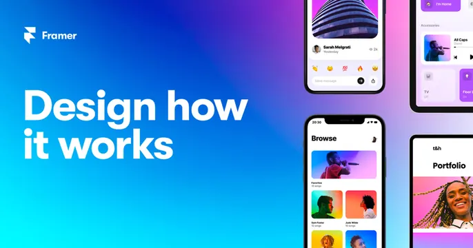
Vibrant blue-to-cyan gradient card with the white wordmark and "Design how it works" headline left, and floating tilted phone mockups right.
Summary
A bright Framer card splitting a bold blue-to-cyan gradient: white wordmark and "Design how it works" headline on the left, a cluster of tilted phone mockups showing app UIs on the right.
Visual description
A diagonal gradient runs from deep blue (top-right) to bright cyan (bottom-left). On the left, the white Framer logo mark and "Framer" wordmark sit top-left, with a large bold white two-line headline "Design how / it works" below. The right third holds several overlapping black phone frames at slight angles, displaying varied app screens: a social post with emoji reactions and a "Send message" bar, a smart-home accessories panel, a music "Browse" list with photo tiles, and a "Portfolio" page. The devices float against the gradient with soft shadows.
Key takeaway
A confident two-zone split: brand and headline on a clean gradient half, a casual fan of device mockups on the other. The angled, overlapping phones suggest range and abundance of designs without needing a single hero screen.
Reuse notes
A strong template for a design or app-building tool showing breadth of output. The bold gradient and big headline reskin easily. Needs several attractive, distinct UI screens to fill the device cluster convincingly.