Preview image. Unlock full-res
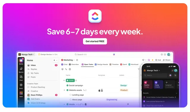
Purple-to-orange gradient CTA promising time savings above overlapping desktop and mobile ClickUp UI previews.
Summary
Vibrant gradient closing section with oversized "Save 6-7 days every week" headline, free signup button, and layered desktop task board plus mobile app mockup.
Visual description
Background shifts from deep purple on the left to orange-red on the right. Centered white ClickUp chevron logo sits above large white headline and white pill "Get started FREE" button. Below, a light-mode desktop workspace for "Mango Tech" shows sidebar, tabbed task views, assignee avatars, and label chips. A dark-mode phone mockup overlaps on the right with quick-access cards and recent items list. UI uses realistic product chrome rather than abstract illustration.
Key takeaway
Bold time-savings copy over real product UI proves the claim visually. Overlapping desktop and mobile frames communicate platform breadth in one composition.
Reuse notes
Strong late-page CTA for productivity tools with polished screenshots. Gradient must stay saturated enough for white type; weak product captures will undermine the layout.