Preview image. Unlock full-res
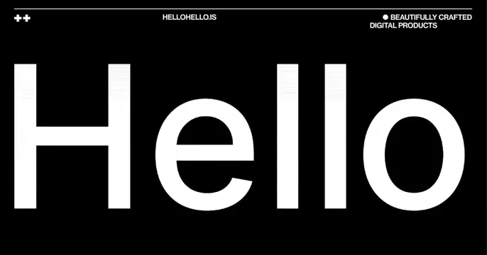
Stark black OG card with an oversized white "Hello" spanning the width, framed by small caption labels at the top.
Summary
A high-contrast black card dominated by a single oversized white "Hello" that runs nearly edge to edge, with tiny utility labels pinned along the top.
Visual description
Pure black background. The word "Hello" is set enormous in white, lowercase-styled sans-serif (capital H, then ello), stretching almost the full width and centered vertically. A thin white rule runs across the top, above three small all-caps labels: a "++" mark at top-left, the URL "HELLOHELLO.IS" centered, and "BEAUTIFULLY CRAFTED DIGITAL PRODUCTS" with a bullet at top-right. The contrast between the giant word and the small marginal captions creates a confident studio feel. Faint texture is visible inside the large letters.
Key takeaway
Maximum-scale single word plus tiny functional captions is a strong studio formula: the word carries impact, the small labels carry the URL and positioning line without clutter. The top rule organizes the marginalia like a poster masthead.
Reuse notes
Great for a design studio, agency, or product-craft brand with confidence to spare. Only works on a stark mono palette where the type scale is the whole idea. Keep the caption labels small and few; their restraint is what makes the big word feel intentional.
More like this







Keep what you find
A free account saves references to boards and can send you a weekly email of picks based on what you save.
To see every result, go Pro.