Preview image. Unlock full-res
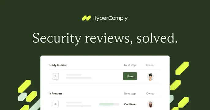
Dark green centered OG card with a logo, a serif headline, a product list panel below, and lime accent shapes framing the lower corners.
Summary
A dark olive-green card centering a logo, a serif headline, and a clean product list panel, with bright lime parallelogram shapes accenting the lower corners. The defining contrast is the elegant serif over a security-product UI in a muted-green palette.
Visual description
Deep olive-green background. The HyperComply logo (lime glyph plus white wordmark) is centered at top, above a large centered serif headline "Security reviews, solved." Below sits a rounded white product panel listing review items grouped under "Ready to share" and "In Progress," each row showing a small doc thumbnail, placeholder text bars, a Next-step action (green "Share" button, "Continue"), and a circular avatar in the Owner column. Diagonal lime-green parallelogram shapes cluster in the lower-left and lower-right corners as accents. The product panel is cropped by the bottom edge.
Key takeaway
Pairing a refined serif headline with a functional product list to feel both premium and credible in a compliance category. Using a small set of bright diagonal accent shapes to energize an otherwise dark, restrained card.
Reuse notes
Good for security, compliance, or B2B workflow tools wanting a polished, grown-up look with one pop color. Needs a clean list-style UI that reads at a glance. The serif-on-dark works only with strong contrast; keep the accent shapes sparse so they frame rather than clutter.