Preview image. Unlock full-res
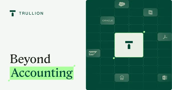
Dark-green OG card with a left serif headline and a highlighted word, beside a tiled grid of integration logos around the centered brand mark.
Summary
A two-panel dark-green OG card with a left serif headline (one word highlighted) and a right grid of integration logos surrounding the centered Trullion mark. The defining move is the bright-green highlighter swipe under "Accounting".
Visual description
Split into a pale-mint left panel and a deep forest-green right panel. Left holds the dark Trullion mark and "TRULLION" wordmark up top, then a large serif headline "Beyond" in near-black over "Accounting" in dark green sitting on a lime-green highlighter block. The right panel is a subtle rounded-cell grid of recognizable software logos (Salesforce, NetSuite, Oracle, SAP, Adobe/PDF, Workday, Excel) rendered tone-on-tone in green, with the white Trullion mark in a glowing light tile at the grid's center as the hub.
Key takeaway
The lime highlighter under one word adds a single punch of color and emphasis to a restrained serif headline. The tone-on-tone logo grid signals "we integrate with everything" while staying calm, and the brand mark glowing at the grid center positions it as the hub.
Reuse notes
Fits a fintech or accounting platform that wants gravitas plus an integration story. Logo grid works only if the partner logos are recognizable. The deep-green-on-mint split reads premium but needs strong contrast on the headline word.