Preview image. Unlock full-res
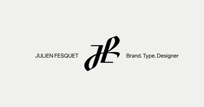
Minimal light card with a centered ornate JF script monogram flanked by the designer's name and role in plain sans-serif.
Summary
A spare, gallery-quiet identity card for a brand and type designer, built around a single ornate script monogram centered on a near-white field.
Visual description
Off-white background with a horizontal three-part lockup centered vertically. At the middle sits a black calligraphic JF monogram drawn as interlocking script letterforms, the most decorative element on the card. To its left, "JULIEN FESQUET" set in a plain uppercase sans-serif with wide letterspacing; to its right, "Brand. Type. Designer" in a matching sans-serif with the three words separated by periods. Everything is pure black on light gray, with generous empty margins above and below. No imagery, no color, no decoration beyond the mark itself.
Key takeaway
Let one expressive monogram carry all the visual interest while the name and role stay deliberately plain and evenly weighted on either side. The strict black-on-off-white restraint reads as confident and high-end without a single accent color.
Reuse notes
Ideal for a personal brand, type foundry, or design studio that owns a strong custom mark. The symmetric flanking layout needs a logo that can hold the center alone. Works on light backgrounds; the all-caps spacing keeps it from feeling like body text.