Preview image. Unlock full-res
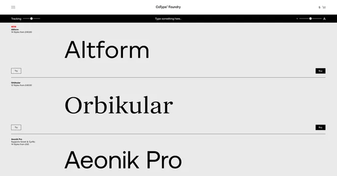
Screenshot of a type foundry site showing oversized specimen rows for Altform, Orbikular, and Aeonik Pro with a tracking and size control bar.
Summary
A direct screenshot of the foundry's specimen page: a control bar over stacked rows of huge typeface names, each with Try and Buy buttons. The product UI is the card.
Visual description
A bright near-white layout. A thin top bar shows a hamburger menu, the centered "CoType Foundry" wordmark, and a cart count. Below it a black control strip holds a "Tracking" slider on the left, a "Type something here" prompt centered, and a size A-to-A slider on the right. The body stacks oversized type specimens row by row: "Altform" in a clean sans (flagged NEW in red), "Orbikular" in a high-contrast serif, and "Aeonik Pro" in a geometric sans, each with small style and price labels and outlined Try / filled Buy buttons. Thin rules separate the rows. Strictly black on white with one red accent.
Key takeaway
Showing the actual interactive specimen UI as the share image: oversized type names plus slider controls communicate "type foundry" with zero explanatory copy. The black control bar gives a crisp horizontal anchor above the airy white specimen list.
Reuse notes
Best for type foundries, font shops, and tools where the interface itself is the selling point. Relies on the typefaces being beautiful and large; only works when the product is visual. The screenshot approach feels honest but dates as the site changes.
More like this

Keep what you find
A free account saves references to boards and can send you a weekly email of picks based on what you save.
To see every result, go Pro.