Preview image. Unlock full-res
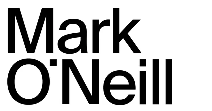
Stark minimal card with the name "Mark O'Neill" set very large in black sans-serif across two lines on a white field.
Summary
A pure-typography card: the name "Mark O'Neill" set in large black sans-serif over two lines, left-aligned and nearly filling a plain white frame.
Visual description
A white background with no imagery or decoration. "Mark" sits on the first line and "O'Neill" on the second, in a clean, slightly humanist black sans-serif at a very large size, left-aligned and occupying most of the card's width and height. The type is the entire design; there is no tagline, mark, or supporting element.
Key takeaway
The extreme confidence of a name-only card: one short name at near-maximum scale, in a single neutral sans on white, is enough to feel like a personal brand. The slight character of the typeface (the open terminals, the apostrophe) does the differentiating work.
Reuse notes
Ideal for a personal portfolio, studio, or individual professional whose name is the brand. Works only with a short name that can go genuinely large; longer strings lose the impact. Add a role line or mark elsewhere if context is needed, since this card communicates identity alone.
More like this





Keep what you find
A free account saves references to boards and can send you a weekly email of picks based on what you save.
To see every result, go Pro.