Preview image. Unlock full-res
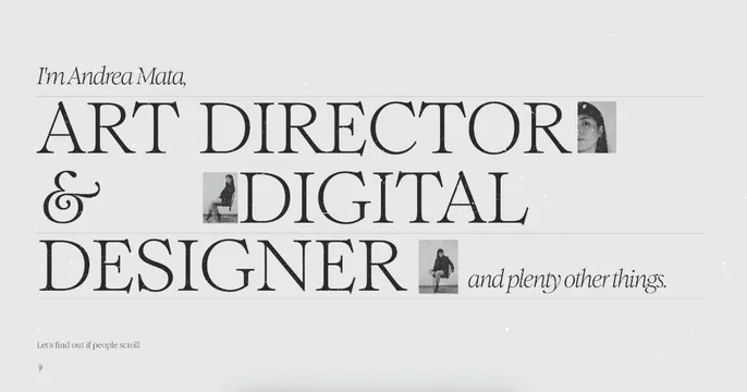
Editorial OG card with oversized serif "ART DIRECTOR & DIGITAL DESIGNER" type interrupted by tiny inline black-and-white photos on a paper-gray field.
Summary
A type-driven portfolio OG card where an oversized serif declaration of role is broken up by small inline black-and-white photos of the designer, on a textured paper-gray ground.
Visual description
A light warm-gray field with faint paper speckle and thin horizontal rule lines spanning the width. A small italic serif intro reads "I'm Andrea Mata," then huge black serif all-caps fill three lines: "ART DIRECTOR & DIGITAL DESIGNER," with a smaller italic "and plenty other things." tucked at the end. Three tiny grayscale photographs of a seated figure are embedded inline within the giant words, sitting in the gaps between letters as if pasted into the headline. A small "Let's find out if people scroll" note and a tiny mark sit at the lower left. The mix of massive serif caps, italics, and miniature photos feels editorial and confident.
Key takeaway
Embedding tiny grayscale thumbnails directly inside oversized headline type fuses message and imagery and rewards a close look. Mixing a stately serif at huge scale with small italic asides gives a strong voice with just two type styles.
Reuse notes
Excellent for a designer, art director, or studio portfolio that wants personality and typographic command. The detail (inline photos, micro-copy) is lost at thumbnail size, so ensure the big role words still carry the card small. Keep it monochrome on a textured neutral for the editorial feel.
More like this





Keep what you find
A free account saves references to boards and can send you a weekly email of picks based on what you save.
To see every result, go Pro.