Preview image. Unlock full-res
Dark split OG card with a white wordmark and headline on the left and a cluster of overlapping light product-UI cards on the right.
Summary
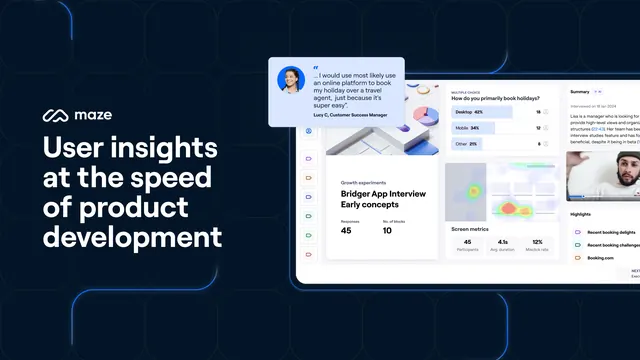
A dark navy split OG card with a white wordmark and four-line headline on the left and a dense cluster of overlapping light UI cards from the product on the right.
Visual description
The left side is a deep navy field with faint corner-bracket accents; it carries the white "maze" wordmark and circular mark up top and a four-line headline beneath, "User insights at the speed of product development", in white sans-serif. The right side stacks several overlapping light-mode product cards at a slight angle: a testimonial quote card with an avatar, a "Growth experiments / Bridger App Interview Early concepts" card with Responses 45 and No. of blocks 10, a multiple-choice results card with horizontal bars (Desktop 42%, Mobile 34%), a screen-metrics card, and a summary panel with a small webcam thumbnail. A thin blue line traces along the bottom-left edge.
Key takeaway
Collaging multiple real interface fragments into one overlapping cluster to communicate a feature-rich platform without showing a single full screen. The dark panel plus corner brackets frames the bright UI like a viewport.
Reuse notes
Best for a multi-feature B2B SaaS where no single screenshot tells the whole story. The cluster can feel cramped, so keep each card readable and let a few bleed off-edge. The dark left panel gives the headline room and contrast against the bright UI.